
3 redundant panels
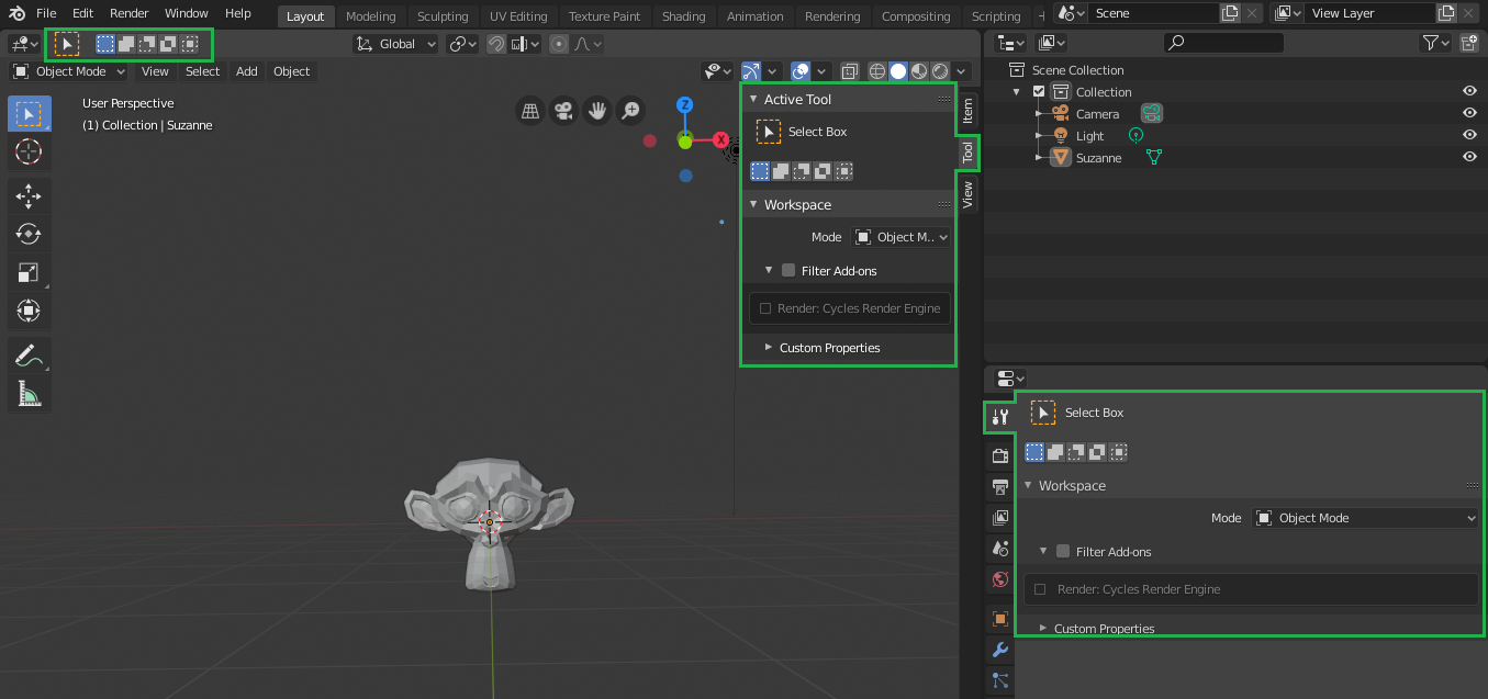
I don´t know if it´s really necessary to have "tool settings" apearing in 3 distinct places: Sidebar (on the right), Tool settings bar (on the top) and in the Properties editor first tab. It´s obvious that in there is no need to make they all appear at the same time if we don´t want, but maybe this redundancy can bemisleading for begginers who would think that the software "has more things" than it really have.
12 Comments
They're only redundant because you're treating them as such. Remove even one of those and the community will be begging them back.
* @akshayxw69 * indeed they are just optional i don't see the issue its all for the matter of Having many options
You've stated the problem, but you haven't actually proposed a solution. I assume you mean that one or two of those locations should be eliminated or that a new universal solution should exist.
You need to specifically suggest which ones to remove or what the universal solution would look like.
* @Jason van Gumster * Maybe all tool properties could be only in the sidebar menu, since it refers to the active tools of the current editor. I really can´t think wich could be the best solution, my biggest concern here is that for some begginers, when a software shows many things at once it makes it appear more complex than it really is.
* @ogat.ramastef * personally the best solution is USE the other panels for something productive
like the most right panel for Material view or Modifiers N Panel for View ,
its a situation where you bascially put yourself in a redundancy since its there for the Choice
Basically YOU DON'T have to see all 3 of them at once , blender is customizable and that's why you can have these situations , The only solution is for you to close 2 of them /use for something else
* @ogat.ramastef * But here's the thing. This site is about proposing solutions. If people only posted problems here, it would only be a place to complain. As users of open source software, we're part of the development process.
* @Jason van Gumster * lol happens to me a lot sorry about that!
* @Jason van Gumster * you´re right! Sorry!
This should exist only in the properties editor, but I understand why it needs to be like that. Use what you want!
Another example is in the texture painting, that it´s panels has lots of tools and functions {attachment 3_coisas_iguaispng}
I dont feel this as being redundant, the top toolbar cant handle all the features, the N menus tool tab is great if you're doing something that would need quick switching between a tool menu and an other menu like sculpting with doing some heavy material editing, or texture painting, so in my oppinion its perfect as it is and you only need to open the ones you want to use. if you dont need the top one you can close it if you dont need the N menu one then you just use an other N tab and if you dont need the properties panel one then dont use that properties tab
People have different ways of working. That's why those options exist. Personally I prefer to use the properties editor, but there are some who prefer to work with a full screen viewport, so they prefer the N panel etc etc...