← All ideas16 Oct 2024Dinesh007OpenUser InterfaceOutlinerDinesh007Albert-OSheaDarknoodlesHatrutsuLongorWickedInsigniaaustinberenyicostaidoganovmhjangslowk1dultrablaster
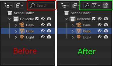
I actually like the shrinking of the search bar when there's not enough room, so the filter and new collection buttons can still be shown. This may be adding a fair bit of complexity, but if the user clicks the tiny search bar, it could expand and 'overlap' the other buttons since the current priority is typing in a search query.
2
c
costa
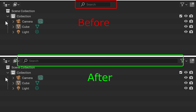
Love the idea, but I would do it a bit differently. I'd minimize the search area to fit only the word "Search" and when it's clicked it will expand. There's no reason to fill the empty area with search it's unnecessary.
L
Lauloque
I don't see the need to extend a searchbar endlessly. Personally I'd even like to have only the search icon visible until pressed.

 3.
3.
3 Comments
I actually like the shrinking of the search bar when there's not enough room, so the filter and new collection buttons can still be shown. This may be adding a fair bit of complexity, but if the user clicks the tiny search bar, it could expand and 'overlap' the other buttons since the current priority is typing in a search query.
Love the idea, but I would do it a bit differently. I'd minimize the search area to fit only the word "Search" and when it's clicked it will expand. There's no reason to fill the empty area with search it's unnecessary.
I don't see the need to extend a searchbar endlessly. Personally I'd even like to have only the search icon visible until pressed.