
3d Cursor Design
I am sure i will get trashed for this, as there are probably a lot of people with nostalgic feelings about this, BUT: that thing is hurting my eyes ! i really enjoy the design of blenders UI and with evee and all it is a pleasure to work with, if there wasn't this oldfashioned thing sticking out. I know i can turn the visibility off, but i find the concept really usefull. So i would suggest an option for choosing a more modern design.
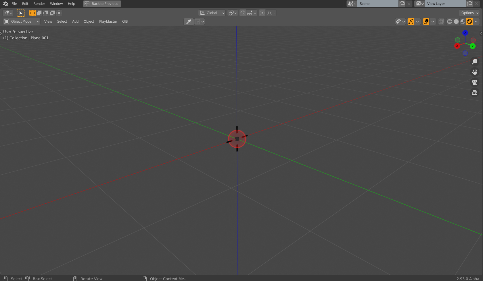
5 Comments
It would be really useful if you suggested a new design instead of saying you don't like the current one. Disregardless of its aesthetics, current 3D cursor sticks out and is very and easily recognisable, so for that it serves its purpose.
Maybe you even right. As far as new Blender's 3D cursor can utilize rotation - would be good to see it as some axis representation. But just to say that u don't like current design, without showing alternative design (you would like) - not work :)
What would you like it to look like ?
What about something like this?
I will be the first one to point out the problems-
Advantages-
Disclaimer: I am not a designer
* @Xeofrios * thanks ! yeah u r right. that would be distracting. I added a image to the post, because i couldn't find how to add image to reply. anyways ... i know my attempt probably sucks, but at least it fits to the ui design. The little dashs could be in axis color.