
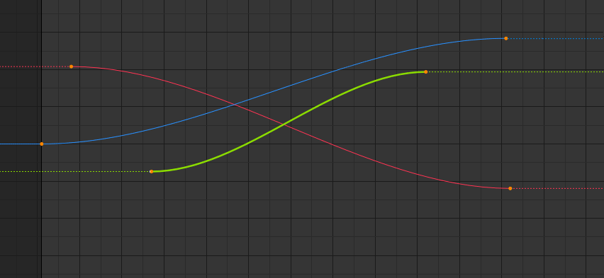
Display of the curve in the graph editor
The thickness of the lines outside the editable curve remains unchanged, and it becomes unclear which part should be edited.
Using a thin line or dashed line will help to better display the editable area.
 and cycle curve

6 Comments
I like the idea of a different visual treatment for the extrapolation, however I don't think a dashed line is the right choice since it's currently the signifier that the curve is uneditable: imgur.com/a/zwBmybp
I believe a thin line or perhaps another line style would be better.
or you could cut all those dashed lines and only use them for cycling Curves, it will look much cleaner imo.
Agree. Dashed variant looks very readable.
But... let's take the green channel leftmost point for example: when you edit the curve it will have a bezier handler on both sides, so how could Blender tell that only the righthand side of the curve is important and therefore should be drawn in bold? What if I raise the left handler and let the curve go downwards or up?
* @ Lsscpp * I do not think it's a problem. You will only know that there are no keys to the left. That is to say, the line does not have to end horizontally, but with this suggestion you know that at that point the editing of the curve ends. (My vote up).
I also had problems with the visualization of the curves when animating, I agree with your proposal.