
Add a new Selection tab
Hello.
I think that Blender's user interaction could be better. I know that Blender's ease of use has increased a lot with the 2.5 version but it's still quite hard to use Blender during the first hours.
When you launch the software for the first time, you have a hard time figuring how to perform the simplest tasks (and the selection is one of the most basic actions of a 3D modeling software).
Asking new users to learn ~30 shortcuts is not the solution, really. Using shortcuts is a fast way to model an object but it takes some time to get used to them.
Most of the time, artists use a combination of clicks on toolbar icons and shortcuts.
- Experimented users will probably mostly use shortcuts.
- Average users will probably mostly use a combination of clicks on toolbar icons and shortcuts.
- Newbies, during the first hours/days will probably mostly use icons/buttons that they see on the interface (panel, toolbar).
And one of the most frequent tasks (if not the number 1) is the Selection.
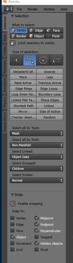
Without radically modifying the current interface, I think that Blender should feature a new "Selection" tab.
Here is a mockup (as you can see, this new "Selection tab" gathers entries from the Select menu + some easily accessible snapping options):
3 Comments
See also : blenderartists.org/t/addon-selecting-panel/1200881
If default mouse click-n-drag trigger a selection box ('B') instead of a grab ('G') it would be better for both beginner and advanced user. This could have a preference to let the choice to the user.
If this panel is added, it should also contain settings for soft selection/proportional editing (radius, falloff type, etc). Context: rightclickselect.com/p/ui/mwbbbc/adjustable-soft-selection-radius-when-not-transforming