
2.8 Properties Panel proposal.
Disclaimer: I realize that similar proposals already exists, but I have some other arguments for doing it this way.
My proposal is to change the tab section of the properties panel. The current issues I see with it are the following:
- having to over extend the width to view the full set of tabs.
- vertical space lost with the context section that shows the current context of the object selected (right beneath the tabs, usually says scene or current object )
- global properties and local properties not being properly separated. (The way it is now the properties panel bunch together settings that relate to different contexts. )
- lots of precision clicking with properties panel tabs.
When beginning with Blender at first it took me a while to realize that some of the tabs in the properties only related to global settings so I got confused at which settings affected what because when they were all bunched up together I thought they were different properties of the object selected. And yes you get used to it, but it's still confusing for the eye.
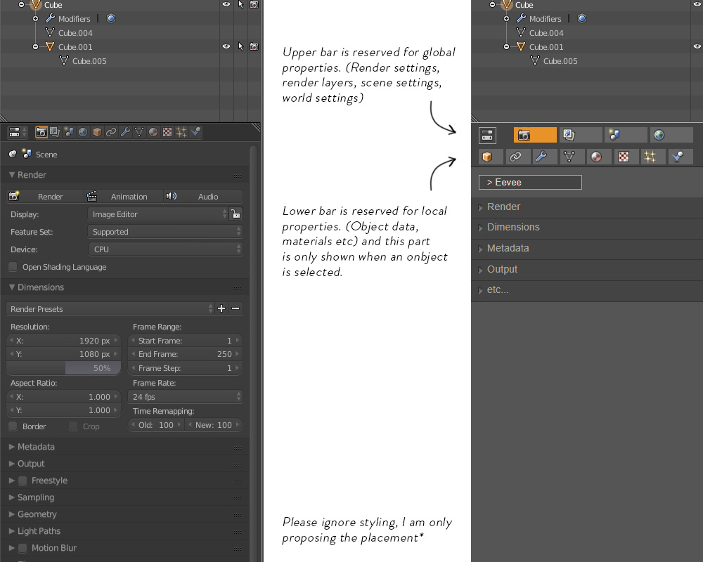
So I propose a two-row layout for the tabs, global settings (Render, Render Layers, Scene, World) in the top, and each tab being a bit wider to help a bit of the precision clicking. These tabs would adjust their width with the properties panel width. Below it the local properties would be laid out and adjust in width also. (This would break up the one-row top bar of all the blender panels, but 2.8 is already breaking this rule with the top bar, and the advantages would be for the better)
This would grab some extra vertical space from the properties panel, which is not desired but then I also suggest removing the context part of the properties panel, will usually say something like scene > cube.001 > material.001 or similar. It's an overview that takes up to rows of space and I honestly don't find it that useful as it's a compressed version of the larger information that is shown (by default) right above the properties panel in the outliner, and in the case of the material properties you will end up seeing "material.001" 3 times, that information does not need to be displayed 3 times right on top of each other.
A disadvantage I see is that some tabs are above others, which sometimes in software can mean the tabs below are dependent on or derives from the tabs above. But the panel is already confusing in a different way and I think the advantages outway the counter (at least for me)
Please check out the mockup below. Let me know what you guys think or if there are any obvious flaws that I am missing.
4 Comments
Hi! Have you checked this design task in the code quest? developer.blender.org/T54951
Particularly this image of a vertical header dev-files.blender.org/file/data/ejied6zrsqntdddi3qpl/PHID-FILE-u4qtz72cjn2wi4rsjhyi/Screen_Shot_2018-05-05_at_13.11.28.png
Your idea of the separation could still be implemented with a small space between global and object properties, with like a small space in the vertical bar
Oh, that is pretty cool, yes, in my mind a spacing between would still be appreciated. Thanks
Good idea.
I like the defining concept separating global and local properties. This is something that irks me working with the properties editor. Having so much information clustered together can become an eye sore.