
Cleaner menus & pie menus
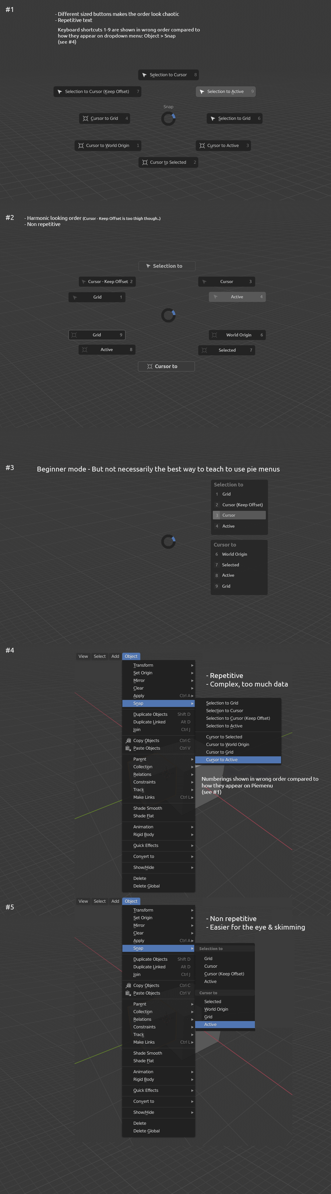
- There's quite much repetitive text in menus, which makes it harder to skim
Current menus might consume more working memory than needed.
-
Pie menus have the same problem, plus varying button sizes make the pie menu look chaotic.
-
Pie menu (shift +S): keyboard shortcuts 1-9 are shown in the wrong order compared to
how they appear in the dropdown menu: Object > Snap

15 Comments
I may be one of the detractors here, but I have absolutely no issue with the way pie menus are currently implemented. Pie menus are organized in such a way that accessing basic functions can be done with only a single button press and a gesture. This is perhaps the wonderful thing about pie menus: it reduces everything to muscle memory, rather than leaving the user to waste time looking at the menu itself. Personally, I use the Shading pie so often that I can name every item and its location in the pie menu because I know the gestures you use to access them.
With the pie menu design that's been proposed above, you can't rely on gesture as much because the items are grouped so tightly in the four corners of the pie. You run the risk of accidentally hitting a command you did not want. There's also the unused space on the left and right of the pie as well as the space occupied by the fairly unnecessary labels that are an issue.
Perhaps the pie menus could be improved somehow, but, personally, I question whether this is the right way to do so.
TL;DR Pie menus are for gestures, not reading.
wote up, agree need to improve pie menus, make UX more predictable. I use only Tab and Z pie menu, because many other of them make me confusion.
Sorry guys, I have voted down - the proposed version maybe seems to makes sense at the first look, but it actually takes much more time to figure out what I am clicking at because I need to realize the needed contextual information.
I hope the author of the suggestion has been using Pie Menus for some time before trying to change it...
One advantage of the current pie menu though is that it doesn't require a lot of clicks just to accomplish a simple task.
The pie menu mockup has too tight menus, so they should be little bit more separated form each other.
* @UIoa * I agree. Maybe array them evenly on both sides but make the symmetry vertical: "Selection to" options on the left, "Cursor to" options on the right.
We could definitely use some improvements over the pie menu
Disagree on the pie menu spacing. The options are too close together.
Agree on the list menu cleanup.
Agree immensely. Experienced users might defend the current model by mentioning muscle memory but, a beginner will have to read all that text just to find the option it's looking for.
* @bruno.souza.lino * I repsect your opinion but it is very common and I would also say normal for every beginner of a certain product to be confused at the start. I cannot find a certain software a scale like this to be that extremely easy to navigate without learning the basics first. Even learning the basics of an OS software like Windows and Linux takes a certain amount of time to get a hang with it but with patience and optimism you will get there and whe you get there, you will understand why such things have been placed or organized that way.
I also had those things. I always wonder why some of those things in the UI have been setup that way and with some amount/ tiny bit of experience abd also with the addtional education from the community, I began to understand some of the principles behind it although blender still has a lot of things to improve with which is also comaparably the same with all other 3d softwares.
* @johnpdelacruz26 * The difference here is, you'll not find this amount of repetition in the reular Windows or Linux UI, because they have taken care as to not repeat redundant stuff over and over.
* @bruno.souza.lino * Your explanations have some merit. These things will definitely clean out some parts of the UI . This might also promote some new ideas regarding how pies menus would be available for some innovative uses. I would be comfortable giving this a plus, mainly to create a larger discussion and also a possible revision of the pie menus.
* @bruno.souza.lino * I don't like how new Blender UI decisions sacrifice the workflow effectiveness because of beginners which want everything to be easy straight away.
* @Jan Kadeřábek * Give one example where a change that's not reversible to the 2.79 way sacrifices workflow effectiveness.
muy buena idea, Pablo debería ver esto definitivamente.