← All ideas
14 Mar 2019
salvador
Done
User Interface
salvador
1to3fall5
AcideRominé
ClarkW
Draise
IIIFGIII
Kartridge
LTorrecilla
LapisSea
Lauloque
Luis.Burdallo
MaMO
Modanung
NiCapp
OldVamp
OscarNebeAbad
Patrick.Towson
Rockbard
ThomasDion-McFumble
WesleySales3d
adamc
afekay
al.mijn.email
alan.zirpoli
andreasus97
arunbharathi555
aryeramaty
bagylender
billyjonsmith
bintangsenjapratama
bnzs
brandonclayayers
cartoon_shaman
chiel
cyrkiel-network
dpdpforlife
fabiocroldan
fiendari
fooblaz
frederico4d
grant.wilk04
hyuri
julien.kaspar
kromar
lambdadelta.witch
levitosio
luciano
manuelgrad.at
marcus
nezumi
nokipaike
orustammanapov
pitiwazou
quijx16
rabatin.dominik
ronald
sandronunes3d
sautron.jordan
sebbosebbo267
silex
slayerdude93
slykdrako
velu
wo262
zinogg
zzzzzig


8 Comments
+1 makes sense!
I vote for this
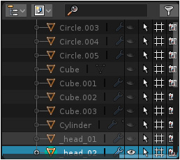
I agree. When scrollbar appears, render check icons became difficult accessible.
The new "Collections" looks powerful and more like other outliners in the industry. But I'm not looking forward to all the drilling down. Who will be the first to make a visual Addon?
@othoap: or an addon to incorporate others funciona, i thinking in modo for examample.
I didn't notice the scrollbar because it's very transparent but you are absolutely right. UI stuff keeps piling up. I guess they did that because it's an autohiding scrollbar but it appears based on proximity and when you want to click on the render icon its already covered by the scrollbar. Even on the left would look better because there are lots of wasted space. :D Hey Right-Click Select and Left Side Scrollbars from now on.
Omg..blocking happends not only there hope they fix this.
I love the idea of collections and i use it a lot, but sometimes that scrollbars are paint in the a :) More padding please.