
Color or hierarchy separation between Physics and Constraints tabs.
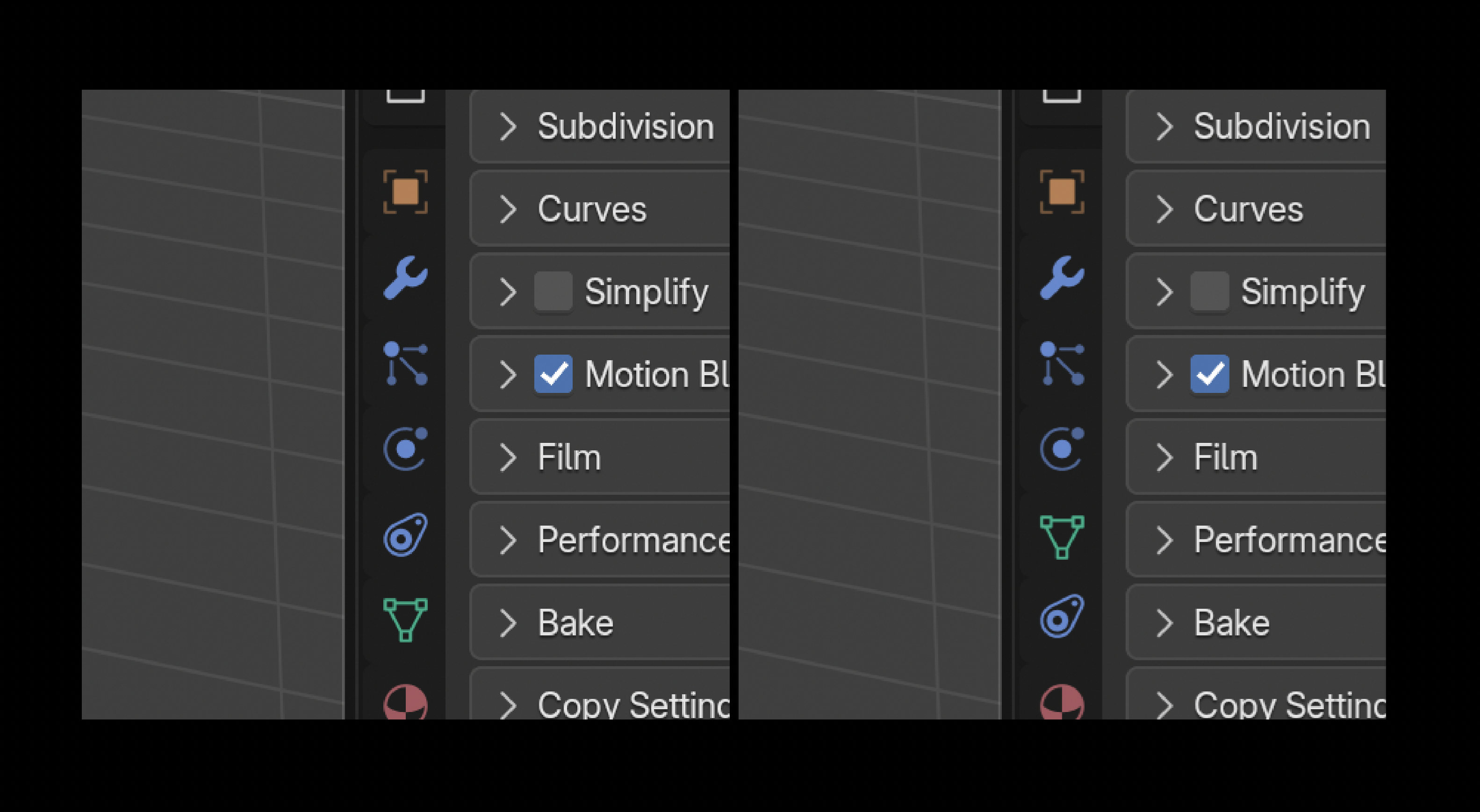
I've been using Blender for over 5 years, and I still get tripped up almost every time I'm looking for the Physics or Constraints tab. The Modifiers tab is very easy to discern, Particles as well for the most part, but Physics and Constraints are very difficult for me to tell apart at a glance. I understand that the Physics tab is supposed to illustrate some kind of object being affected by another (like a gravitational orbit) and the Constraints icon illustrates "mechanics" but one could argue that they are almost interchangeable as both deal with some form of phsycis... but I digress.
I know there's historically been some hesitancy from the Blender devs and community to over color the interface, but I personally think that in cases like this we are pretty limited with only 5 colors. Stacking 4 icons of the same color next to each other causes hangups for me almost every time.
I'd propose that some form of color differentiation between 1 or more of these icons would be very helpful.
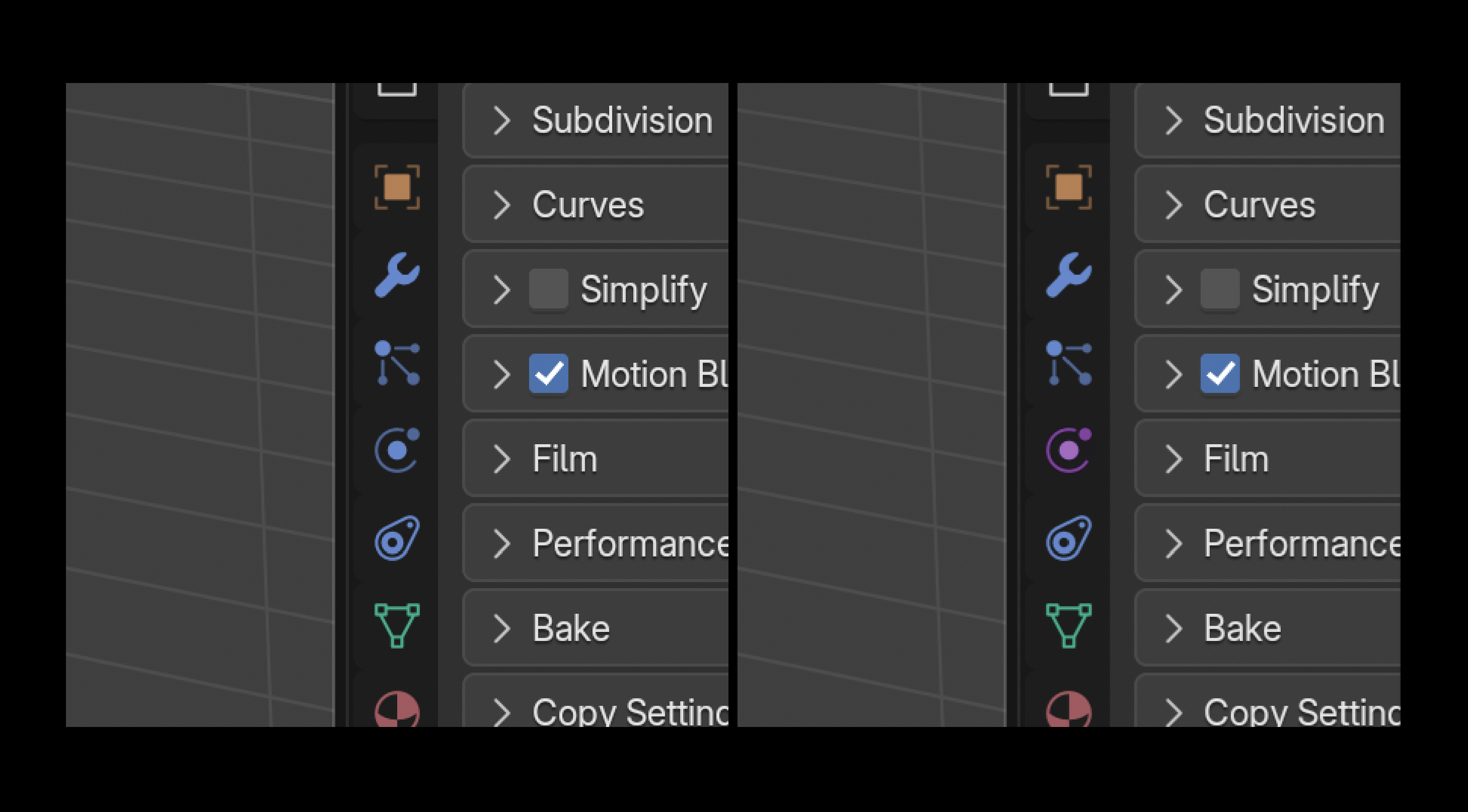
Alternatively, we could at least allow users to reorder the tabs so we can separate the 4 blue icons into an order that helps us discern them more easily.
3 Comments
I understand, but the thing is that both color and order have a meaning to be the way it is. All blue icons are object-level relationships.
Modifiers are blue. Physics are basically modifiers. Constraints kind of also but arguable, however, they do exist at the object level.
This sounds like it could be solved simply with a more distinct icon for Constraints?
Personally what I do is just hide tabs I don't need, since very rarely I need to switch between Physics, Particles, and Constraints at all times.
Thanks for the response, Pablo. The context helps. I do think that the similarities between the Physics and Constraints icons are the biggest problem for me.
Both have a big circle and a small circle.
Both show the shapes interacting with each other in some way.
Both are angled in the same direction.
If the devs are open to some ideas, I'll take a stab at a new concept for one of them.
Definitely! I'm open to new ideas.
In 2.7 it was a "chain" icon, but we're using chains for linked items since 2.8.