
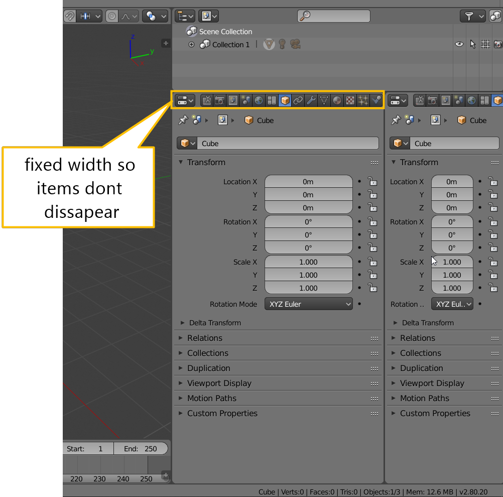
fixed minimum width of properties panel
a option that i would like to see is a minimum width for the properties panel so i do not have to constantly rescale it to get my desired width of that panel.
its probably a quick thing to try so it would be nice if someone could have a go at this.
11 Comments
I agree that it's a pain when some of those icons disappear, but I also don't want to lose the option of setting the properties window to an extremely narrow shape.
Perhaps instead of a minimum width, we could have it wrap the icons onto two (or even three) rows as the panel is narrowed and reaches a certain 'trigger' width.
developers are already working on tabs developer.blender.org/T54951
@valentinwn: that is nice, however does not change the width scaling issues that i encounter a lot so i think the issue is still valid after rearranging the layout.
I think you have not read well. They will replace the top buttons with tabs on the left. This will not hide the icons when the window has a very small width. dev-files.blender.org/file/data/ejied6zrsqntdddi3qpl/PHID-FILE-u4qtz72cjn2wi4rsjhyi/Screen_Shot_2018-05-05_at_13.11.28.png I am French, sorry for the translation.
@valentinwn: i totaly understand the concept, and yes it will not hide the icons but there is still the issue with the width of the window that is not holding the content properly when to narrow. also since it has not even been tried how that vertical layout is working for the properties its highly speculative to say it will solve some of the current issues. also the introduction of addon panels (like in the old toolbar) will clutter it and we will need a vertical clamping as well to see al the icons^^ id rather have the icons bar horizontal and conforming with the rest of the headers and dynamically adjust rows/columns depending on the width of the window (liek the new toolbar). i think that would be the better way to go than taking away more horizontal space by putting them on the side.
maybe the specification of my first post was a bit to much focused on the icons, i think they are only part of the scaling issue and to be honest have been less of a concern over the last 10 years of using blender than the resizing of the properties panel to find a comfortable width to fit all the content in there. i honestly do not care if some icons go out of screen but of course its nice that it gets addressed, although i feel its in the wrong way. not only does it break a ui consistency by having everything horizontal except for the super experimental tool bar thing which showed really well how that concept clutters the ui even more, it also will take away precious width of the properties panel. but hey we will figure out soon how good that concept will work and i hope we will at least see some experiments with other ways for the properties panel since i believe its going in the same direction as the tools shelf did.
@grauer.d:
ok since i get quite some heat over this proposal heres an follow up question, how is the current minimum width used today?
when reducing it to a minimum we get this result, shouldn't this be changed so it at least shows some useful context or that it behaves like the properties panel and can be completely minimized? tell me what you think
I often use the width "0". I "slap" the panels of nodes to my left to work on the 3D view, then I take it again. Limiting the minimum size will limit this possibility. You tell me that as long as the ui has not been changed, there is no reason to believe that it will be better. But there is no reason to believe that it is worse either! ... I am French, sorry for the translation.
@valentinwn:
just to clarify, when talking about a "option" im referring to a optional functionality that allows to do this... doesnt mean its fixed for everybody like some people prefer the header at the top and some at the bottom and that is also a "option". i cant see how anyone would consider this to be a bad thing.
also i dont get what you are doing, wouldn't maximize the window be a lot simpler? ctrl+up in 2.79
Yes I know, however I rarely need only one panel.
Currently, if you want to grab a button without resizing the area, just drag it to the left with a mouse middle button.
@valentinwn: please stop trying to explain me how to use blender, im using it for over 10 years daily for work and know perfectly well how to use it. this is not about me not knowing how to handle certain options in blender but to improve its user experience. i personally could care less if it stays this way since i used it that way for years. but hey we have a chance to improve usability for everybody and i think this would help a little bit.