
Small GUI tweak. Panel Shadows.
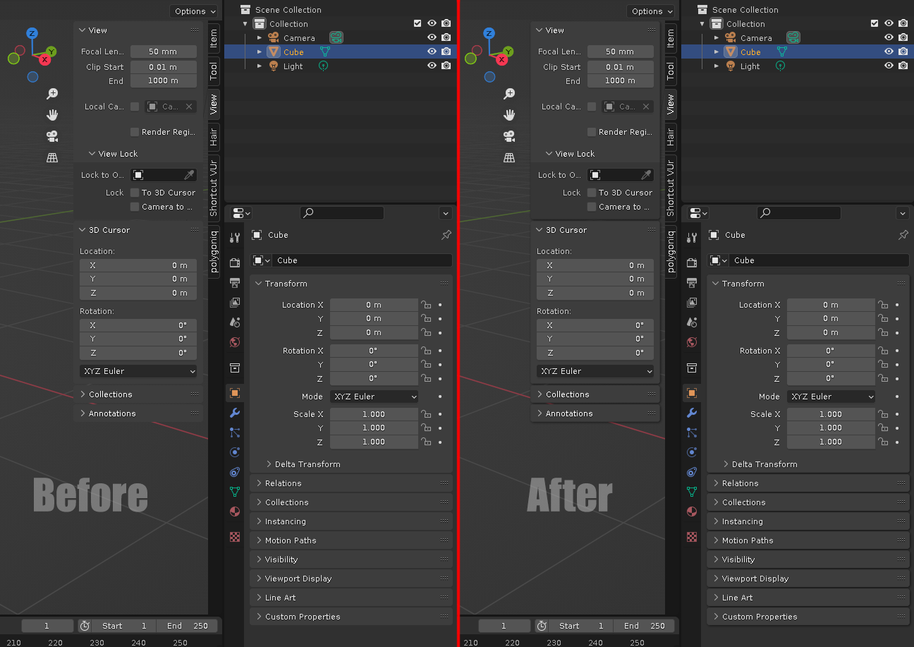
Adding shadows under panels would improve readability.
Clearer separation between panels.
Panels will not blend into the background of the 3D view, as they do now.
I'd also propose to increase the distance between panels by a pixel or two for an even better result.
4 Comments
Should be an option though
Sure. All the power to the theme makers :)
IMHO if you need shadows to have an optimal readability, then the color scheme is not contrasted enough in the first place. ¯\_(ツ)_/¯
Personally, I prefer to avoid them, as well as gradients and rounded shapes, to keep things clean.
But I get that some people want shadows anyway.
It would be impossible to make a backgound color blend with the panels if the shadows are there. So contrast becomes not an issue anymore at all. Any colors and any contrasts will work. Changing the contrast for the default theme would work for the default theme only. It's a hack, not a solution. Also, if shadows are an option, you get both...