
Reference Image transparency checkbox - better placement
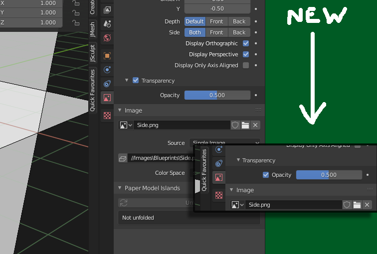
For my uses, I find the transparency checkbox for reference images pointless and a rather inefficient use of space. Plus, it's easy to forget because it's not as close as it could be to the alpha value slider.
I'd remove it entirely and just use the envelope value, but in case someone finds it actually useful instead of yet another PITA Blender speed-bump/papercut , I propose that the check box be moved to be at the same vertical height as the envelope value. See the mockup below.
I think this actually works well with changes Pablo (?) has been making to panel layout.
2 Comments
I personally think it's quite useless to have a checkbox for opacity.
If Opacity = 1 then it's opaque.
If Opacity < 1 then it's not.
No need to add an extra checkbox to enable/disable opacity while its value already does the job.
{attachment firefox_2020-07-05_17-42-36png}
* @-L0Lock- * , I'm NOT "adding" a checkbox, I'm MOVING the existing checkbox.
For whatever reasons they put it in there. Whatever, I think it's a misfeature. But it's easier to get things reformatted/rearranged than removed from the code.