
Grid size/scale marker overlay in 3d View
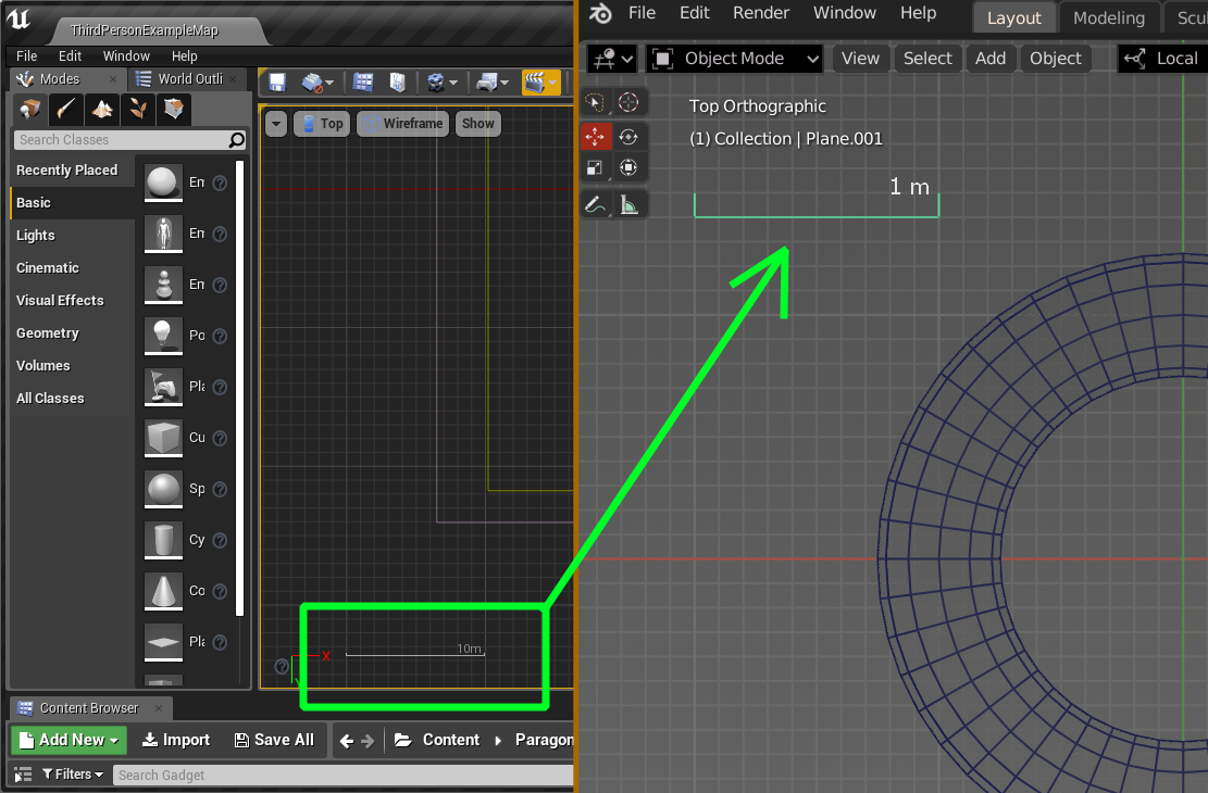
Can we add a visual overlay with "line" that shows distance between major grid lines at current zoom level in Ortho views and dynamically changes when zoom changes? Just like it happens in Unreal Engine 4 viewports. That would be really handy and at any situations (even when grid line hard or not visible) you can always see at what "size"/scale your models is regarding world (at current zoom level). And our eyes will say "thank you" too. My mock-up is rough but I hope you get an idea. Of course it would be nice to have ability to change it's visual size (like for transform gizmo in preferences) and screen position.
10 Comments
Current 2.81 builds have a scale indicator in text form at the top left corner that changes dynamically along with the grid . It's helpful, and doesn't clutter the view too much with yet another graphical element. Looks like a happy medium between your suggestion and the current situation, no?
* @Faruk Ahmet * thanks to share, that's a happy medium indeed.
This what I have also observed. Currently blender slightly lacks the data/information UI. These things might seem less significant in hind site but the small details offers a substantial amount of assistance for the user especially in larger scaled projects. To be specific, one example would be like better dimensions data information similar to cad softwares. Blender already has it but the data is placed at the top left corner with small font size. It would almost feel slightly slow and challenging if you want to try modelling with precision.
why do you need a line, that's what the GRID is for. one box = whatever the number says.
* @testure * because for people who work on large scale scene "one box" it's not always a 1m - major grid line subdivision is DYNAMIC and on different level of zoom it can means different (1cm, 10 cm, 100cm, 1000 cm), also not everybody uses default units. Sure video would better explain this, but for those who uses UE4 and works on level or landscape projects it's obvious feature.
* @yunisio * you miss my point (and incorrectly assume I downvoted you, martyr complex much?). My point is that the grid is already there and usable as a reference point- this is what software like Modo uses to great effect. As the grid changes dynamically, so does the scale (or vice versa, depending on how you want to look at it). If you set the grid to be 'fixed' the scale does not change as you zoom in and out. Blender does not do this currently- but it could. My point is that the viewport is already cluttered enough, why use yet another viewport overlay to communicate information that is already readily available with an existing element. I'd rather the Blender UI not start down the path of looking like an airline cockpit again.
* @testure * Sorry mate my bad, no offence, and I totally agree with you about "airplane cockpit" issue, but while many people feels alright about Poser-like button navigation (totally useless imho) this scale marker would have really handy for LARGE-scale scene makers. Grid is fine but working with that all day long makes eyes really tired as you have often try to distinguish major lines subdivision and minor ones. And 'fixed' grid scale has nothing to do with this issue - grid must be dynamic otherwise on distant view grid lines merged together in solid plane. Moreover there is no option to assign different colors to major and minor grid line as it could be done in some vector graphics editor. Hope you can understand what I talking about.
* @yunisio * This issue has been here for a while. I hope the small scale creators/users don't downvote those features that would aid the bigger production pipelines. I would underdtand if you guys would decide not to vote but if the only issue is more about airplane cockpit,then I cannot think of another practical way that would work more effieciently and easilly without the implenebtation if this kind of interface. What I am trying to say is that An airplane cockpit of a UI as you would say, cannot be eliminated or removed in this kind of workflow if we are talking about bigger kind of productiins but what I can say is we can make it more pdesentable, intuitive, and less chaotic. Lastly the good thing is these things will not be a fixed element of blender's UI and most of it would definitely be an optional feature to those who will not be utilizing it.
* @johnpdelacruz26 * You say there's no other way- but I've described a way. I'm not just inventing new things here, it's been done. See what else is on the market and make informed comparisons rather than assuming the only solution is additional complexity.
* @testure * I am not singling out your opinion but I am just trying to say something that is related to this matter which is UI elements which can be a little bit non significant to some.