
Different UI Properties Tab
Hello Blender Team,
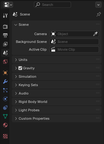
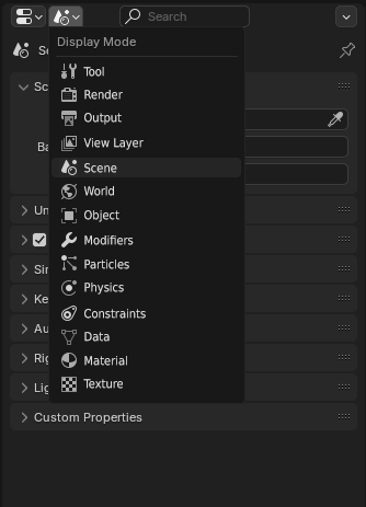
I believe that the "Properties Tab" could adopt a design similar to the "Outliner" editor, which has a dropdown menu on the side. Implementing this for the Properties tabs would simplify Blender’s user interface and offer a more streamlined experience.
For example, many of these menus could automatically switch to the relevant settings when we click on an element, as is already the case. If we click on an object icon in the Outliner, the Properties editor automatically switches to the Object settings. The same applies to Mesh, Modifiers, and Materials. Most of the time, we only need to manually enter these menus when we want to add a new material or modifier.
Before:
 After:
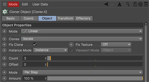
This approach is also used in other 3D software, such as Cinema 4D, where a similar categorization is implemented. My intention isn't to suggest copying other software, but rather to provide the user with more flexibility. It would be ideal if users could choose in the settings how these tabs are displayed, similar to many other tools in Blender.
modes are marked in red:
Thank you for considering this suggestion.
2 Comments
Definitely do not prefer that personally. A list requires more work from the user to click, browse and then confirm. The Outliner's Display Mode menu isn't used very often while the Properties tabs are used extremely often, they both have different needs and it makes sense to keep the tabs always available.
I also don't believe it's enough for the properties panel to assume what the user needs. I do most of my selection via the 3D view, not the Outliner. It's just easier to identify something in the scene than scroll through a massive list and click on a tiny icon to get the tab I need.
True, but having a second mode wouldn't be bad either. For example, it could be an option in the settings.