
Adaptative direction interface
At the current moment, Blender suffers from an "in-line" organization of panels. In other words, the direction of panels is static, going from top to bottom.
It would be better if a condition were added to the interface where the width and height of the window are analyzed. Based on this criterion, the panels could be distributed accordingly. Also, an option to "force" the direction would be good.
This option should also be set for interface elements like the tools panel.
Image 1 shows a concept where the asset panel can be positioned on the side instead of only at the bottom.
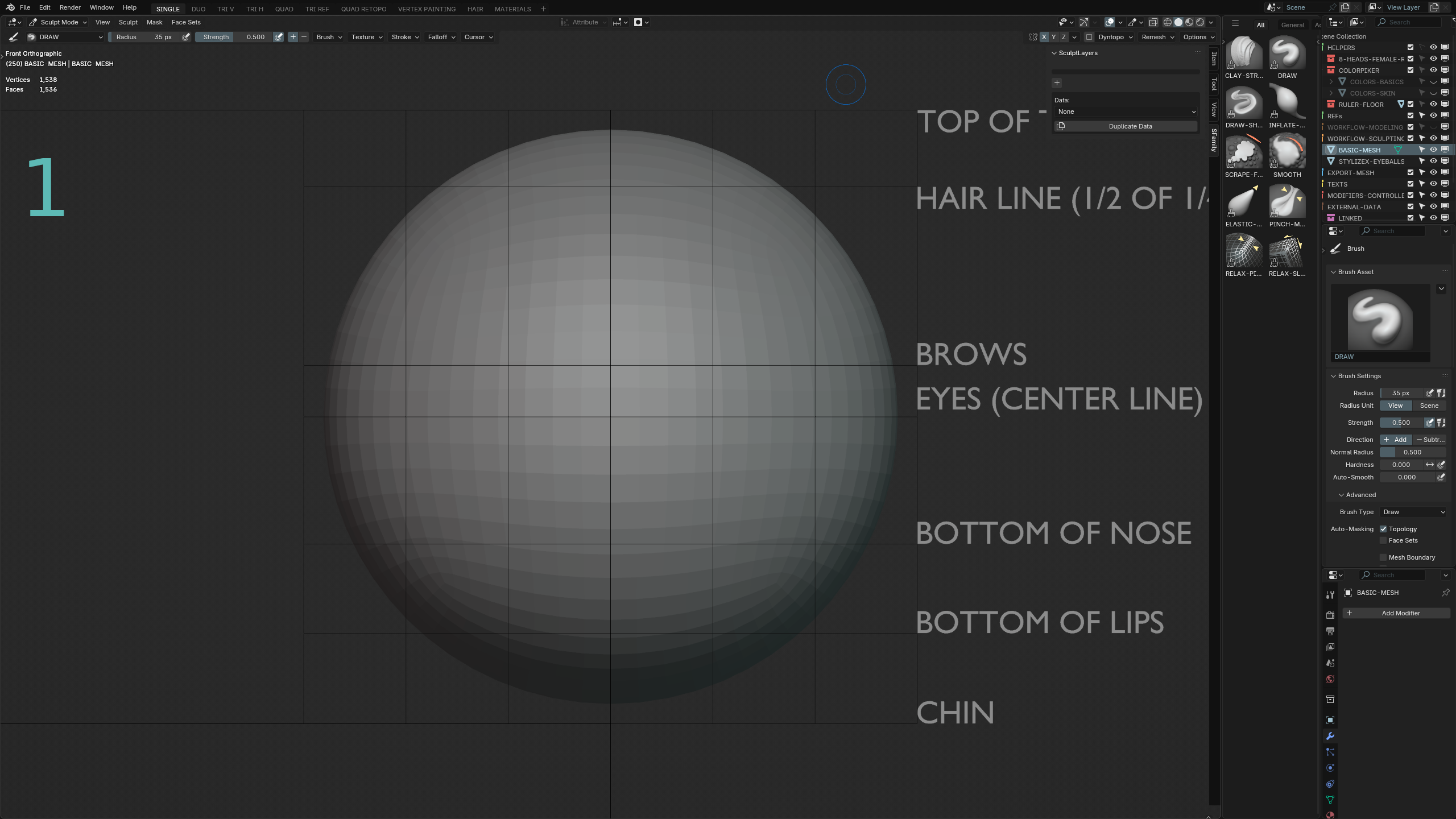
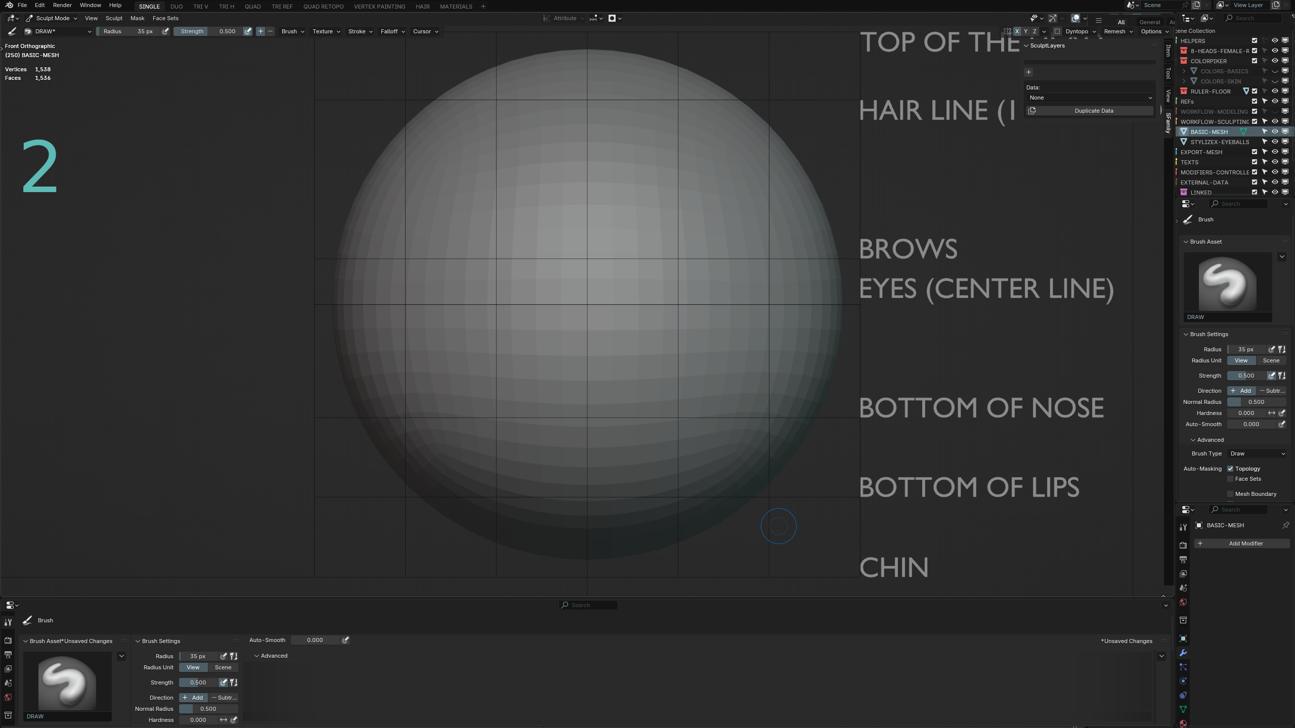
Image 2 shows how the properties panel would look if positioned at the bottom.
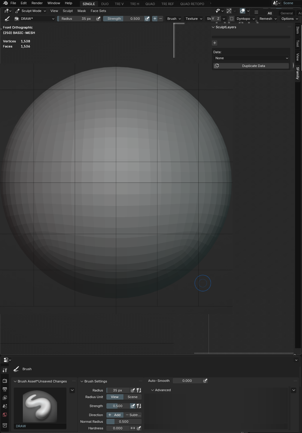
Some people may think: "Why?" First, more customization means a custom workflow, which saves time for some people and also offers more possibilities for Blender usage, like in the last image, where a monitor can be set to portrait mode, which is really good for sculpting and painting.
1 Comment
Regarding properties panel at the bottom:
Blender 2.49(i think, up to 2.5 cant remember) had properties panels with both top to bottom and left to right hierarchy. UI was redesigned to have it Top to bottom and more organized. This not only makes sense from user perspective but also when writing the code. Many plugins even today try to cram too many things at one place making it not readable. When you look at the UI it just does not make sense especially for the beginner.
You can still recreate this UI by splitting and pinning. Save as startup file and you are good to go, literally 1min to setup.