
Align UI Elements in the 3D View
Blender’s 3D View has a lot of panels, and their layout looks fairly haphazard. Creating rules to line things up in the interface would go a long way to making it feel cohesive and organized.
Current UI:
- Elements have inconsistent padding and corner rounding
- Lots of visual noise
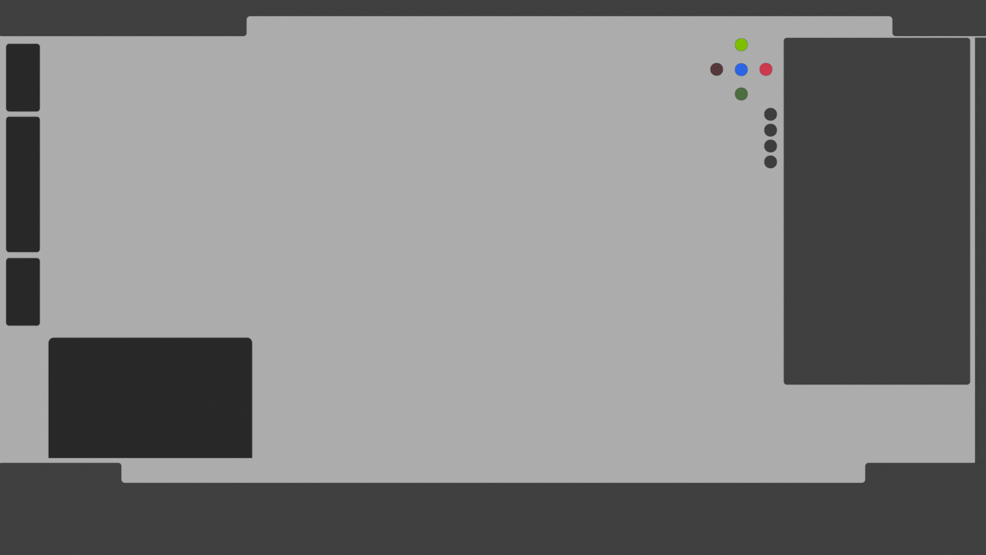
Proposed UI:
- All floating areas have the same padding and corner rounding
- Notches cannot be shorter than a panel they’re directly adjacent to
- Redo panel is placed below sidebar and shares the same width
- If the sides of the notch are close enough together, they are joined together.

This technically takes up more space in the areas where the notches would otherwise be shorter, but those slivers of space are not really useful and certainly not worth the misalignment and visual noise.
With redo panel minimized:

With sidebar hidden:

Other option for the redo panel, in case it is not practical to have it on the right:
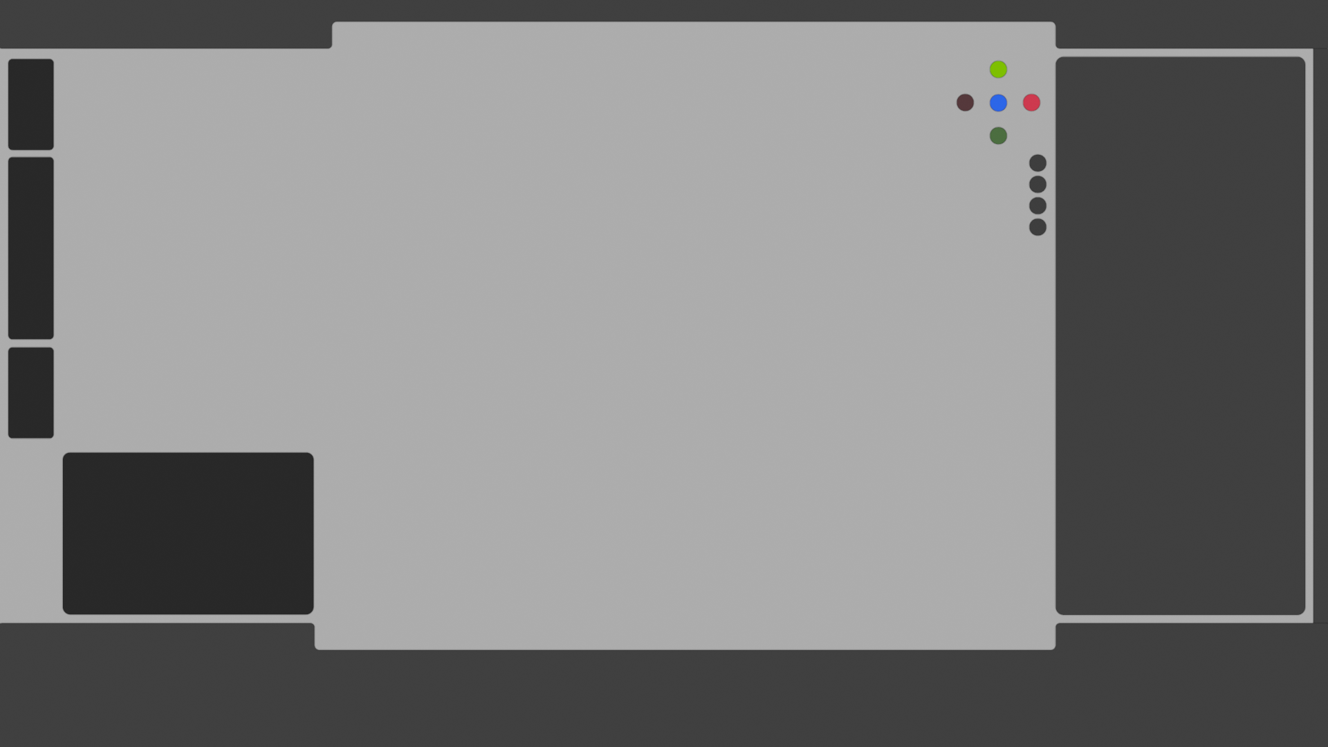
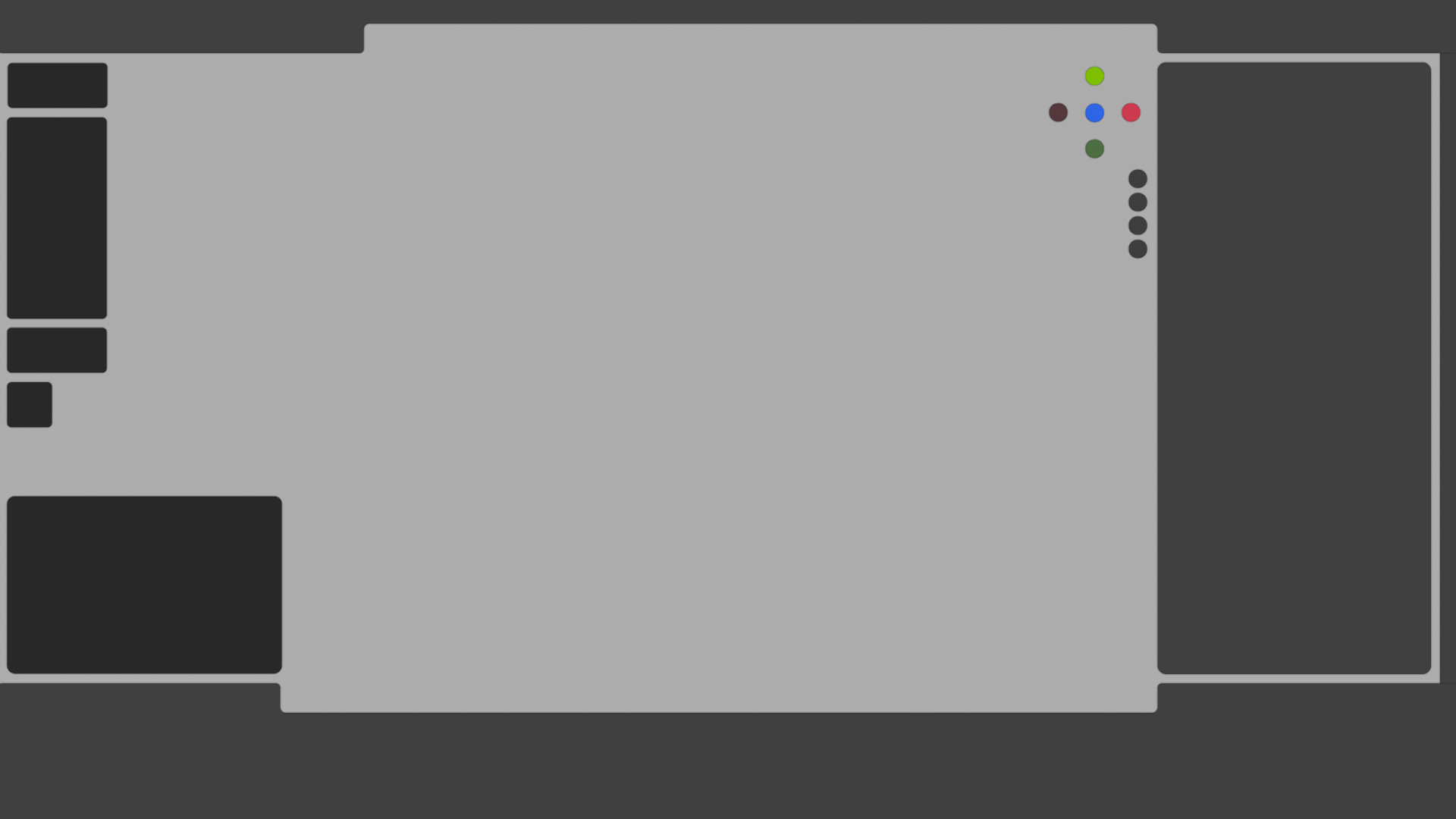
Notice how it still aligns with the Asset Shelf notch and has the same corner rounding as the sidebar. Though of course it would be much nicer if it was tucked under the toolbar when possible:
2 Comments
Moving the notch to the far right of the screen, is also going to move all the display-related buttons that are in the notch further away from the 3D view itself. It's also going to give less vertical space to the right-side panels, which would be a negative for me.
In addition, if one does not use Region Overlap (I prefer not to), then now the header is just that much wider filled with empty space.
Overall, i think the proposal is well-explained. But is very targeted on making things look nice for use with the asset manager. What if one isn't actually using that manager on a regular basis?
The fact that I struggled to draw a line between your UI mockup and my 3D Viewport setup makes me think this will be a tricky UI challenge, given the sheer amount of custom configurations. For example, I never have the Asset Shelf visible, and I use a darker theme, which makes the viewport feel more cohesive overall. That said, I agree on a couple of points:
Edit: leaving an upvote in the hope this will be seen by the UI team