
Some advise for modifer UI of geomtry node.
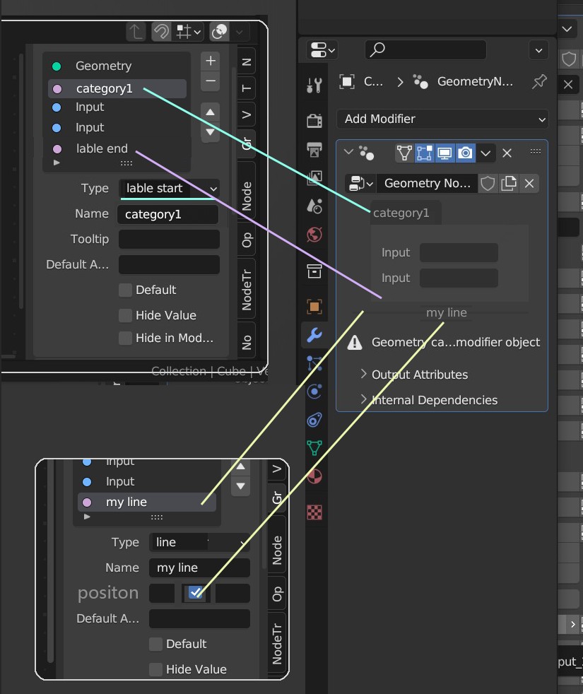
a better layout can make the node info clear. if there are soo many options without lable or category the user will be very confuse
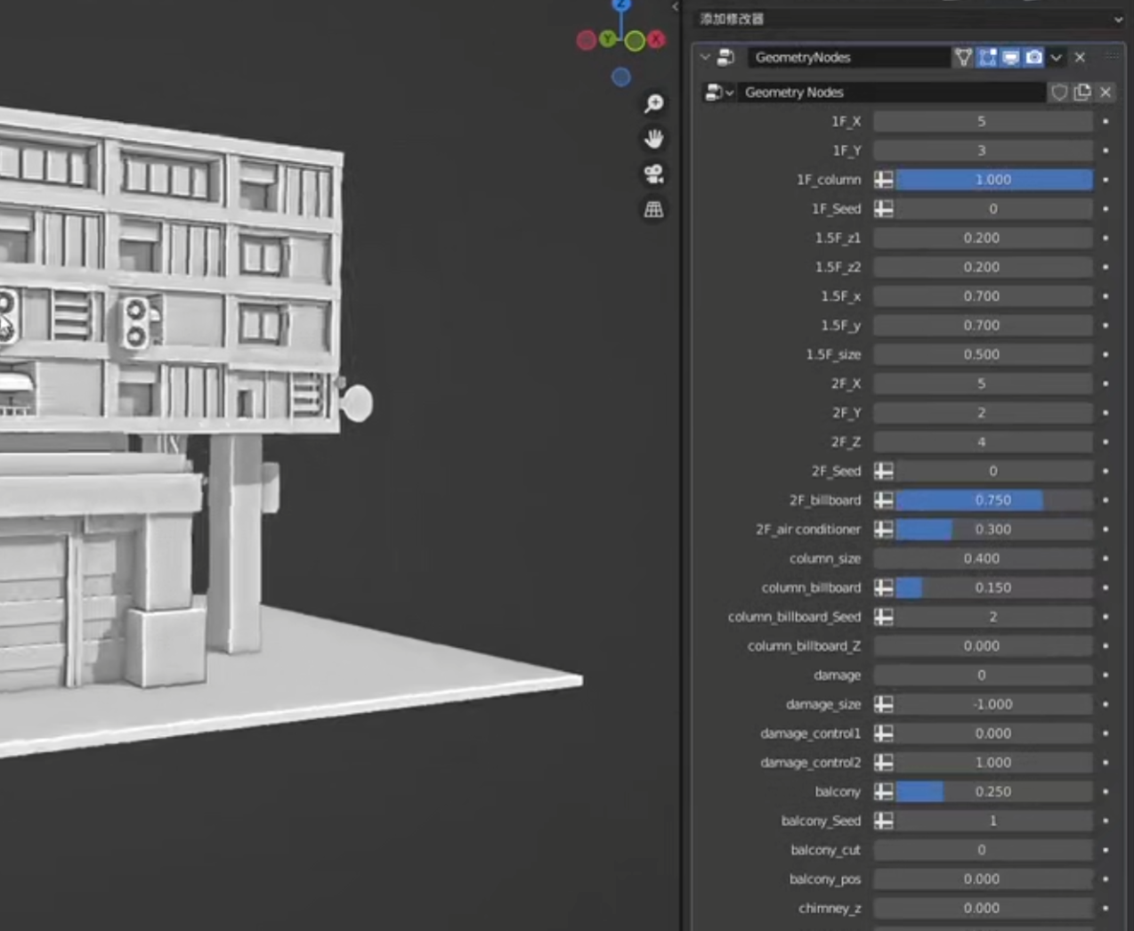
bad exmple from internet:
i think me and others really want to have a nice layout in GN UI but there did`t any way to do this .
line and lable(category) is really necessory.
4 Comments
Some time ago i stumble upon this pull request. It seams to be working fine. projects.blender.org/blender/blender/pulls/108565
I think will solve some of your issues. And is a good add overall.
nice update!some time it really convenience to put some setting option to the Subpanels like the update show.but it need to open and close folder frequently.
sometime just want to make the input option a little bit clear and it is enough.
So a Line for GN UI is necessory at least.
but put some setting option to a Subpanels is a better idea.
Could you elaborate please ? Mockups are nice, but they don't replace explanations.
I submited my explanations.A complex GN really need those tool for UI layout.