
Compact GUI for modifier panel ( especially Geometry Nodes)
Generally the GUI of Blender is cool. But I always have the feeling that the GUI of the N-panel is wasting a lot of space. Especially when exposing values in Geometry Nodes the modifier gets long and barely readible at a certain degree.
I attach a screenshot from the 3ds-Max Modifier Panel which allows more compact layouts, allowing buttons side by side, separators, sensitive menus, etc. .. I know it's no small thing to implement ;), but maybe some inspiration for future builds ...
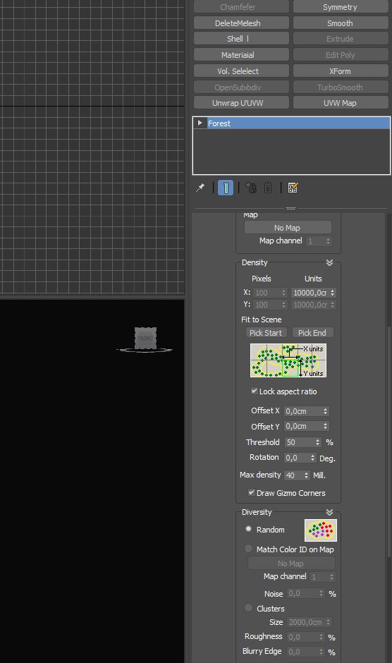 .
.
0 Comments