
Node UI improvement
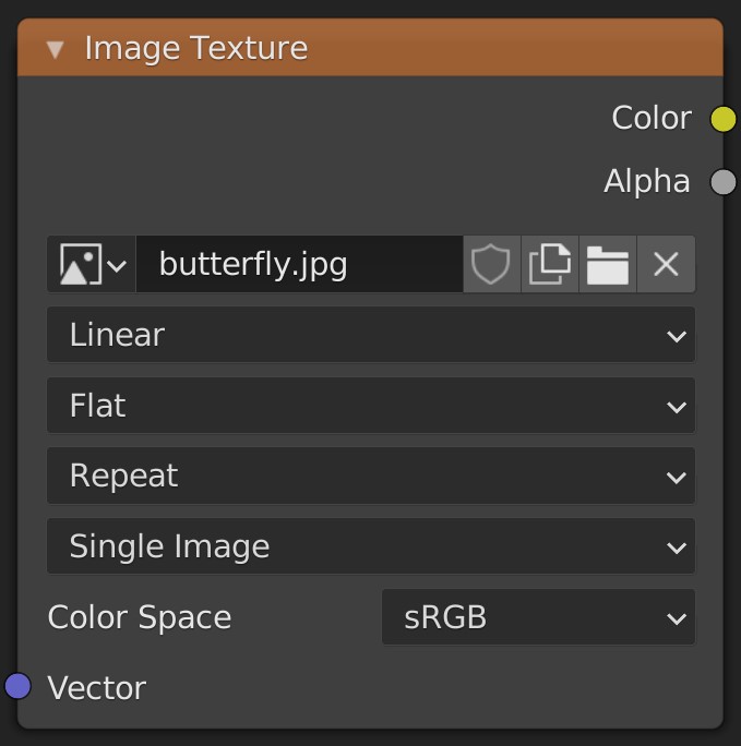
The Image Texture Node UI doen't follow the current UI Standard for Blender. As we saw Blender had a huge UI fix from 2.83 to 2.90 . But many of the Nodes UI seem to be forgotten. There are many nodes which doesn't follow the standard. Among them is the current Image Texture Node . This node only exposes the Label of Color Space and hides the other labels for some reason. It also pushes the alignment of this label to the Left instead of Right .
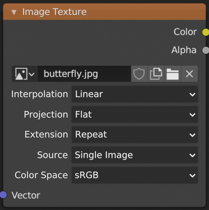
So i propose an UI change where all the Labels are shown and they are aligned to the Right making it look compatible with rest of the UI. Also other nodes which have Menu Dropdowns should follow this change as well.
The Old UI :
The New UI :
2 Comments
I would not want this for all node dropdowns. Too many nodes have long names in the dropdown Musgrave has "Ridged Multifractal" Environment Texture Node has "Equirectangular" so i would prefer to keep it as is. Improve Node-Editor Tooltips instead i would prefer tips i.e when you hover over musgrave types there is no tips yet etc compared to other nodes.
So nodes have to be wider then. There are wider nodes out already in the Geo Nodes. And besides having little space for nodes isn't ideal.