
UI Vertices Data menu small improvement
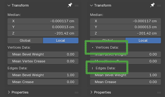
I can`t even count how many times instead of changing edge bevel weight I choose to change vertex bevel weight and then discovered that my bevel modifier with weights is not working. I think, I may not be the only one.
Here comes the proposition to distinct somehow those two very similar UI fragments. I am not convinced if adding a small dot and a vertical line is the best and the nicest way to fix UI here (maybe not so consistent with the rest of Blender) so any other improvement is appreciated, but constructive idea is better then saying - now is quite bad. Cheers!
3 Comments
Or just remove "Mean" from the property names, and tidy up names to something like this:
100%. Small qol improvement
Nice idea, maybe they could be the same icons of vertex and edge selection in edit mode, especially since these are accessible only in said mode.