
switch tool shelf and toolbar?
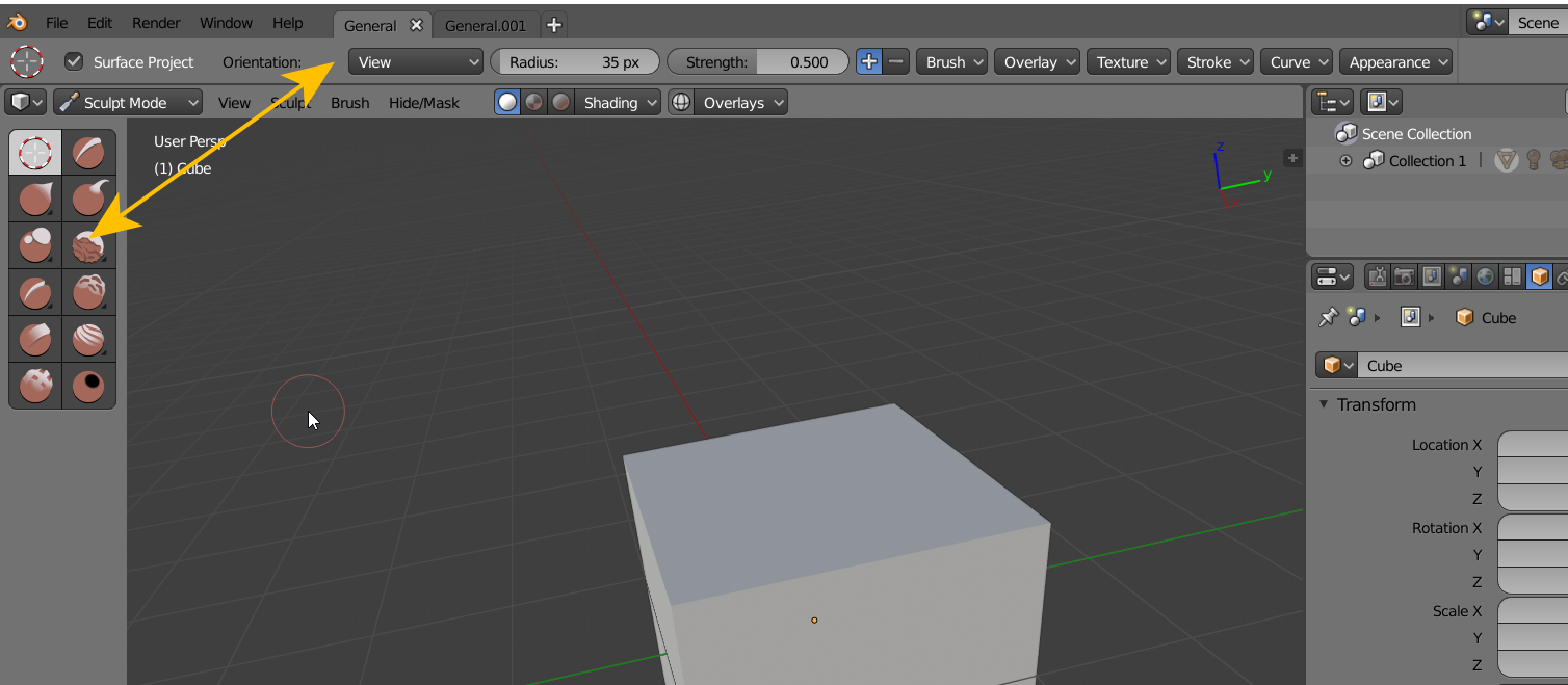
i do not completely understand the decision to split the tool shelf apart but i think its current implementation is really not good. Im sure there are many great thoughts on how to improve it so here is mine: exchange the toolbar and the tool shelf content.
Since there are a lot less tools that take away vertical screen real estate and the non consistent menus of all the tool options is a real slow down i suggest that the 2 bars get switched so the tool are in the top and the tool-shelf on the left will then contain the functionality like in previous versions of blender.
4 Comments
Not first who asking bring back tool shelf. Vote up. Dont like the fact that some one think that stole from me setting from Toll Shelf and put it in to this Top Bar is something what I need. I dont need this buttons at all and especially as replacing of old " T " pannel. Give me back old goog tool settings.
I understand, maybe Blender could implement bars that can be dragged and placed where the user prefers, many softwares have this feature. But I think this decision of the UI & UX team was good, especially for artists with touch screen and pen, since they can easily change with their left hand the brush they want to work with.
The 2.8 design follows conventions set by other software (Adobe products come to mind) and I believe this to be a good thing, perhaps not for someone who's used Blender to the exclusion of other software, but for everyone else.
New users will learn Blender faster than we did because they'll be encountering concepts of UI design that they've already become accustomed to elsewhere.
And for those of us who go back and forth between Blender and other software, it's less of a shift in thinking. Overall, I think the 2.8 design is heading in the right direction, so I'm sorry, but I've voted this down.
@rontarrant:
i see your point, but then the tools should be part of the toolbar since the concept that most follow these days is creating tabs in the top. so maybe new users will encounter something "familiar" however i believe, if it compromises usability, it might not be the right choice. And as a long term user i think this reduces usability and speed overall.
EDIT: on a 2nd thought, if we would follow the design concept that you mentioned we would put the tools from the left side to the top since those represent the "tabs" and then you would have the functionality that you work with in the tool shelf on the left.