
Rename, prominently and clearly display interaction presets
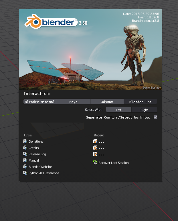
Mockup:

There's three points to this proposal:
1: Rename the Blender interaction presets to be meaningful.
Suggested:
- Blender (default) -> Blender Minimal
- Blender 27X -> Blender Pro
2: Change the way the interaction presets are displayed on the spash screen, to a more prominent display. Include a left/right select option which updates upon selecting an interaction preset.
3: Display, and allow changing of, a setting which lets you seperate or combine selection and action controls.
Explanation:
1:
Currently, the Blender 27X name for the old keymap preset makes the keymap feel legacy, outdated and not maintained. Whereas the 27x keymap actually represents the keymap that most experienced users are likely to use or base their own personal keymaps from. The name should reflect this.
Without a clear preset to move into after a new user has gotten familiar with Blender (espescially given the new default keymap is aiming to have fewer keybinds), new experienced users of the future will end up with a far broader range of chaotic control schemes as they eshew the legacy looking 27X interaction preset and begin creating their own hotkeys from scratch.
If a clear preset with a fast workflow exists, and is displayed and labelled prominently, experienced users can move to it and/or base their keybinds off of it. This is useful in a myriad of situations, not least of which is that shared workstations can easily keep a common control scheme and expect users to mostly know it. This helps to maintain a semi-standard interaction preset across most experienced blender users
If the minimal keymap is labelled appropriately, new users will understand why it (the current default) doesn't have keybinds for every function when they go looking for those keybinds. If they start looking for more keybinds, they would understand the need to either modify the keymap or move to the full one. This would lead to less frustration when some menu items display a keybind next to them whilst many others don't. It's also more obvious which keymap to start with when creating an entirely new custom one.
The change would also free up the new minimal keymap to truly be more minimal - the removal of some useful keybinds is less important when it is clear that this keymap has few keybinds, and it is clear that a more complete standard preset exists.
2:
All of the above rely on the user being aware that the interaction presets exist, and what they are. Currently the splash screen shows a dropdown for the interaction presets. This is easy to miss, and does little to tell the user anything about Blender's controls.
By displaying the options more prominently, as pictured for example, the user get's to see the most common options at a glance, and if they are named clearly, can understand what they mean.
The addition of the left/right mouse selection and "action/selection" toggle also tell the user a great deal about whatever preset they have set, if they update whenever a new preset is selected. It also allows the user to change those options immediately and easily if that is the only option they want to change.
3:
Currently (Blender 2.79), The switching of select to the left mouse button automatically disables a good deal of the separation between action and selection. These should be de-coupled and allowed to change independently if possible, making left or right select a matter of switching the mouse buttons.
Primarily, the checkbox would be there to, again, display information to the user at-a-glance about the key differences between the interaction presets beyond the keybinds. A user would know that the difference between the industry standard presets and "Blender Pro" have more to do with the action/select checkbox than the mouse button switching. The fact that the "Pro" preset turns this on ultimately leaves new users less confused about why Blender's mouse works so strangely, comparatively.
11 Comments
The only issue with this is.. what happens when you have more than 4 modes that are created?
@ondraise15: It's not meant to display all of the presets that might be available, but the main ones. The layout is just a mockup, an example.
A similar layout could display 8 presets quite easily and without getting too cluttered. I doubt more than 4-8 would ever be needed as 'main' presets, otherwise it would defeat the point. A "...More" dropdown of some sort could possibly even be added to handle less common presets or user-created ones if it becomes an issue.
The main driving point is to have the main 'standard' presets displayed right on the splash screen, rather than behind a dropdown menu.
@antaiozi: These are setting you generally only change once, unless you have a multi staff workstation with each a different taste in how they use Blender. I would consider it unnecessary bloat. But it is nice as a concept - for sure common features need to be exposed if changed often.
@ondraise15: It's not about having the setting accessible or about how often you change it.
It's about giving the user clear and concise information about the control presets. The information needs to be brought to the forefront. It's about helping new-to-blender users with their most important startup setting. It's about preventing users, a few years from now, having entirely random and varied control presets because they didn't know or notice that fully functional keymaps existed. It's about removing debate over defaults and enabling the default be separated from the experienced user layout, without having the experienced user layout be forgotten as legacy. It's about empowering the minimal layout to become truly minimal because if users know it's supposed to be minimal they can change to a full preset.
The absolute last thing it's about, is exposing the setting and making it more accessible. It already is technically accessible on the splash screen via a dropdown menu.
@antaiozi: In that case I agree, make it known.
In this case my quipe would be refined to.. I wouldn't remove the dropdown in the mockup - you have to accommodate to more than just or 4 or more. For hotkey devs you need toggles right up front to a myriad of more than 8 maps at a time.
They are creating a wizard to help users who enter Blender for the first time. I think it takes up a lot of space But I do not like the name "Blender Pro", I think the current name "Blender 2.7X" is better. They are also working on a more standard version, very useful for people who do not use only blender, it is very interesting I invite you to read it. developer.blender.org/T54963
@fabiocroldan: Blender Pro better describes that keymap, the people who use it, and why.
Just like Industry Standard describes the keymap you linked.
I'd like users to understand what the names of keymaps mean. At the moment, there is a discrepancy where the maya and max presets are descriptive, but the default blender and 27x ones are not.
@antaiozi: a question: Do you have any further usage scenarios beyond helping new users that would require these options in the splash screen (and therefore visible each time you start up Blender)?
From my point of view: I would either expect 1) a "first usage dialog" of sorts, which could help set up these and other important preferences or 2) for these options to be properly documented (for instance in a getting started guide) and clearly visible in the user preferences.
The reasoning behind this:
@rwees: Not beyond a workstation with multiple users that use different presets, no. Though the proposal is also about users transitioning from a minimal standard preset to a more fully-functional one, providing a clear 'upgrade path' to help keep user keymaps mostly standardised going forward.
The proposal is intended to be relatively small in scope, and deal with issues specifically revolving around Blender's controls and keymaps, it's something that can likely be done reasonably quickly, now, before 2.8 releases. Whilst transitioning the settings to a first use dialog or a getting started guide in the future would work great, the scope of such an endeavor is quite large. The interaction preset settings I feel are the most important startup settings, and exposing them to the user clearly even after initial setup has more benefits than simply making the settings easier to set.
The only part of the proposal that is large in scope is separating an action/selection toggle out from the left/right select option. This part of the proposal isn't as critical, and I beleive the desired effect would be achieved regardless of it - I considered leaving it out.
Also, given the nature of programs such as Blender, I would fully expect new users to be overwhelmed at the start and easily forget, miss, or gloss over items on the splash screen or any first-time-setup screen that might popup. Having it be displayed at every start eliminates most of this issue.
@antaiozi: Thanks for the clarification. It would indeed make sense in a multi-user-workstation setting.
However, in that case, would it be more helpful to expand the proposal to cover a 'complete configuration'? (i.e. include addon selection, UI configuration, etc.)
yes,just do it