
Panel Icons
Hello,
We at Take-Two Interactive are currently in the process of fully moving to Blender for all of our artists and pipeline work.
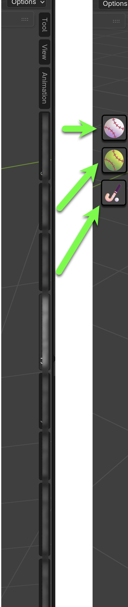
Our pipeline is massive, and one recurring piece of feedback from multiple artists is that we need icon support for panels in the 3D View.
We have 20+ individual tools, and they don’t fit in the sidebar even on large displays.
Another issue is that our team is international, including partners in Asia, and it can be difficult for them to read tool names displayed sideways in English.
They are used to an icon-based workflow from Maya.
This would greatly improve the user experience.
Best regards,
Petr
25 Comments
It's official, we got a RCS from Take 2 before GTA 6.
<3
Was only experimenting with this also in our Bforartists fork (has well has vertical text), has well has via allowing choosing icon via addons.
Though the way harley wants to do it, is probably the better way.
youtu.be/WMYfM-R7uf0
I quickly threw together a dirty prototype on the fly using the code from the PR link provided by Harley (thanks to him for working on the PR!) to show you how this could be implemented after discussing your request with Harley. As you can see, it's just an inverted glyph without any color variations. I told Harley that many artists like to scale their icon tabs, but since we don't know what size icons you were referring to, this aspect is still undetermined. I hope this information was helpful to you! You can watch a video of the prototype on YouTube: youtu.be/5_YsqIA7Y34
One thing could really help with this idea would be someone taking the time to propose what we could use for the current built-in categories. Are there icons that could be used in place of "Item", "Tool", "View", "Animation" that would be quick and obvious to recognize? If there are multiples that work within the Material Symbols set that would be even better. If none make sense that would help tell us the idea doesn't really work.
That’s something for the Blender UX/UI team to decide, but there are plenty of examples in other DCC tools and game engines.
Hello again! I'm currently working on a prototype that will improve this area! Stay tuned for updates, and I'll let you know when the prototype is presented. I hope the Blender community and developers will appreciate the design I'm offering :)
Rather than directly support custom icons, I'd rather first consider supporting using text symbols as category titles. We do allow including symbols like ☂ ☹ in the titles - and Blender's font stack includes almost every Unicode symbol - but I'd love to alter the drawing of them so that if the title is short enough to not require rotation, then don't rotate it. Then if we add an icon font, like Material Symbols, you'd have thousands to choose from. I've got an experimental PR here: projects.blender.org/blender/blender/pulls/121603
No, that’s an engineering solution that won’t work in a practical pipeline. We really need custom icons because each tool has its own symbol that reflects the tools in the game engine and other parts of the pipeline. They also follow certain color-coding rules, etc.
Like this maybe? projects.blender.org/blender/blender/pulls/154985
Omg yes!
Not to mention so many addons now do have official icons thanks to the Extensions platform requiring it, so I'm sure a significant amount of them will like the option to actually use it, plus it would allow to help reduce the sidebar tabs bloat. Especially if we also let the user chose whether to use either-or-both labels and icons when available.
Exactly like that! perfect!
Mockup added.
Thank you guys!
Please pinch me, someone. I don't believe that such large teams don't adapt open-source tools to their needs (I personally rewrite everything I want to improve the usability of Blender, and I'm not even a programmer). Adding icons in the sidebar of add-ons instead of text is a solvable task for a regular programmer if you're willing to work with a custom version of Blender. The most challenging aspect of Blender is that it simultaneously benefits from its speed and lacks intuitiveness for users who are used to icons. Please provide a mockup or other images so that we can contact the official development team with a specific proposal and address your request. We love Take-Two Interactive games and the game development team! Sincerely, Nazir.
Screenshot or a mockup of what you're describing would very great to see. :)
Hello Petr-Maxa,
You might think that I promised something interesting and then disappeared while the core developers are doing the real work. That’s true — I genuinely admire what they create every day.
The reason is that the prototype I’ve been working on has grown significantly in scope and required a lot of time. I believe its features will pleasantly surprise you.
You may ask: “When will it be available?” That’s a fair question, and I’d like to give you a clear answer.
Please message me today or tomorrow on ArtStation: nt1000.artstation.com — I will send you a reply with a download link to the prototype. (Also, everyone who participated in the discussion is welcome to message me on ArtStation, and I will provide access for testing.)
Planned release time: Planned release time: April 1st, and it's not a joke :) In addition, you can read this post on Wednesday — I'll share a link to the discussion thread on BlenderArtists.org .
Thank you for your patience. I hope the Blender community will enjoy this prototype.
Soon. Very soon.
UPD: I have updated the post because I don't have time to complete the error debugging
Food for thought.
n-panel is overused... Icons will not change much as people will throw even more - hitting the size issue again.
And what about situation where addon doesn't have icon and only text? Sometimes converting addon idea into proper icon is a very hard task so it could lead that many n-panel icons would look the same (any addons which is set of tools).
Generally when executed right - it could be nice but also pose some serious UX issues.
Wouldn't it be better to have some nicer solution than using and overusing n-panel to death and then some? Dunno - new custom dockable panel for addons like that?
Enable icons for panels in the global Blender settings? If an add-on panel doesn’t have an icon, fall back to a default one or use the first two letters of the add-on name to generate a placeholder icon at the same size.
This totally not solve the UX problem. Imagine 20 addons with small tab icon button insead of current one to click and browse through. On hi res where icons can be very small and therefore buttons? Plus not everyone can create a good recognizable icons so - chaos.
First two letters are horrible idea. 3 addons without icon for example like Modeling Helper, Modeling Assistant, Modeling Extra Tools. All of them would have either Mo or some random or the same icon - again chaos and confusion.
Problem is the UX and that n-panel is overused which op post actually confirms.
Per addon option to show icon instead of text label - could be good for this particular case.
But not as global either icons or labels.
Hi! Stay tuned for updates! I'm already working on a design and prototype (which can be tested immediately) that will take into account all user feedback, so we won't need to create a new panel. N-Panel and tabs are a convenient concept, but they need some change. I'll let you know when I've presented the prototype and design.
Thank you Nazir!
The sidebar is overused. That's a fact. Having the possibility to have at least some tabs use an icon instead of a long text will not solve the issue. That's also a fact.
But it will help reduce the issue. That's the fact to keep in mind.
Also, more and more addons do have icons.
Paid addons had them for a while already, for marketing reasons. And since the introduction of the Extensions Platform, which requires icons to display on their platform, more and more addons have been getting icons since Blender 4.2.
Ok, more addons have icons. But the sidebar/n-panel will not have them at a size like toolbar have (it would be weird plus would take a lot of space if some labels would be text and some icons).
To have both text tabs and icon tabs - icons would need to be very tiny. I was designing icons for modo for long time - operating and keep them readable and informative at 13px at worst, 16px regular was often hell of a challenge.
There's no problem when icons are built in into system and are expected. When you have 20-30 icons - small - and you want to find the one you wanted - also takin into account that they might change their location - it sounds to me like hell of a problem long term. Users can adjust and definitly they will fit more addons.
Having iconed tabs is definitly something which will solve X but also introduce Y.
Definitly it will not hurt but also can introduce some strain (not all users are 15year olds with good eyes and a lot of energy of "i don't care i just click").
What do you think about adding a " Panel Manager " button?! This button will pop-up a small windows to manage Panels, allow user to:
Hi again! I thought I'd never finish the prototype I was talking about. But here it is. You can find it and download it at blenderartists.org/t/custom-tabs-tag-system-and-improved-add-on-workflow-x-nazir-build/1636143/1 I hope you and other Blender users enjoy it!😊