
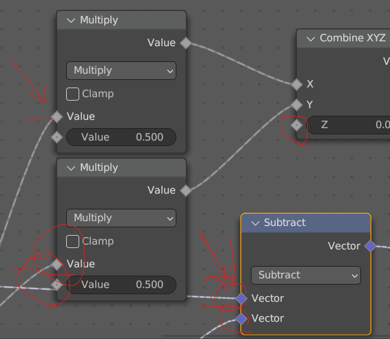
It is recommended to align the grid points so that the connection lines are neat and easy to read
The connection point and grid point are not in the same point position, making it look uncomfortable. It is recommended to align the grid points so that the connection lines are neat and easy to read
4 Comments
I'm downvoting, simply because it borders on OCD. If one disables the grid points (which have little practical purpose), then there's less visual clutter and the lines are even easier to read.
I don't think it's really a big deal either way. But it's not really just a visual "OCD" thing, because the grid points also show snapping boundaries, and having them almost-aligned-but-not-quite-aligned to connection sockets does create some awkward situations where E.G. you can have reroute nodes that are snap-aligned to the grid but harder to organize because they fan out ever so slightly near node sockets. So there is some practical usability friction that is created by the misalignment too.
Then why not have Blender remove grids altogether and just eyeball everything?
Having everything line up especially when you disable the curve and add pivot points on complex setups to enhance readability makes complete sense. Even more so considering node libraries that are sold.
They should also have the node height snap to the grid and ensure that newly created nodes have the width snap onto closest grid points.
Putting in these measures and having these expectations will tidy up many of the nodes products and help end users.
Aesthetics is a part of readability; and not at all OCD
It doesn't have to be binary.