
Some idea on outliner
Sometimes I find the toggle icons are easier to approach if they are at the left side, what do you think?
Toggle icon align to the left, data blocks icons align to the right

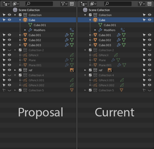
Sometimes I find the toggle icons are easier to approach if they are at the left side, what do you think?
Toggle icon align to the left, data blocks icons align to the right
5 Comments
I agree with the alignment of data blocks itself at least, not necessarily with the shifting the sides so maybe split this idea in two
I'm on the fence on this one. On the one hand, I would prefer toggles to be closer to the workspace, on the left. On the other hand, when you have more than 2 of the toggle categories enabled, then it would seem like a weird choice to put them on the left. Visibility and interactivity toggles are one thing, but if you have all 6 toggles enabled, and they're on the left, I think the toggles would overpower the actual objects. I think, at this point in time, the outliner needs to improve its visual design and readability before changes like this will work. Because right now, even with the toggles on the right, Blender's outliner is cluttered and hard to read.
disagree: this looks overloaded {attachment 2141607jpg}
Also, if you want to keep vis/edit toggles closer to workspace, just try to switch outliner to left. {attachment 2165211jpg}
and this is unnecessary ugly space {attachment 2155808jpg} So disagree twice.