
Enhanced Addon Interface for the N-Panel
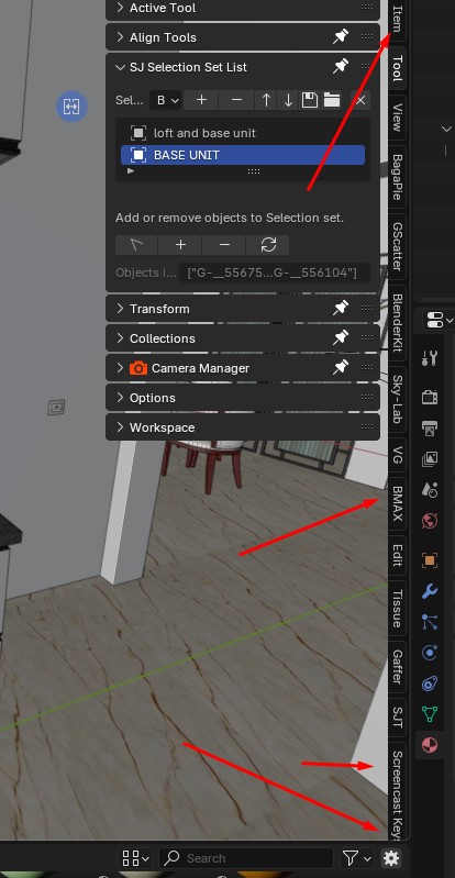
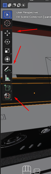
The current vertical display of addons in the N-panel is hard to read and interact with. To improve usability, consider replacing the vertical text with small logos or icons representing each addon, similar to the toolset on the left side of the interface. Users should also be able to rearrange the positions of these addon icons for better customization and workflow optimization. Additionally, hovering or holding the cursor over an icon can display the addon name as a tooltip for easy identification.
This update would make addons more accessible, visually intuitive, and user-friendly.
4 Comments
I doubt turning addons' tabs into tool icons will solve this issue. I'd actually fear it would be potentially worse; mixing up GUI systems that don't do the same thing (icons that change the active tool vs icon that just shows a panel), wasting screen space, what to do with non-addon tabs, ...
Plus requiring an icon for each addon to work in the GUI is an extra "cost" on the addon developers (we already CAN have icons, yet most addons didn't consider it was worth the trouble to have one).
And I euphemistically doubt all addon devs are good GUI designers, so requiring one will definitely end up with a mix of terrible and decent icons, and definitely with overall inconsistency that will make the ensemble look jarring at best. And we can see that in softwares with such design requirements.
That being said, letting the user be in control of the tabs and how to populate them is the final solution to pretty much every problem. Addons like SIMPLE TABS really show how powerful that is, and I can't imagine what it could be if it was a thing out of the box instead of a wayaround solution.
Addon API very customizable
Blender developers are not responsible for how addons from the community are implemented. If you want to suggest how an addon should looks, it's the addon developers that you should contact.
I meant the way the addon shows vertically is hard to handle, so make it as tool set something look like Logos for particular ADDONS. and need the feature of arranging the Addon positions in between those.