
Better selection area for gizmo
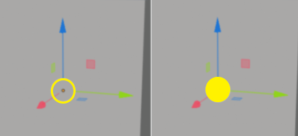
In yellow on the left side is the current one, on the right side the correct one.
edit: The yellow represents the selection area, it does not represent what the gizmo would look like. This is the selection area in Maya:

Can the selection areas be increased in a general way?
2 Comments
it's in progress developer.blender.org/T58072
at least an option for that would be nice, also to be able to keep the gizmo visible would be nice