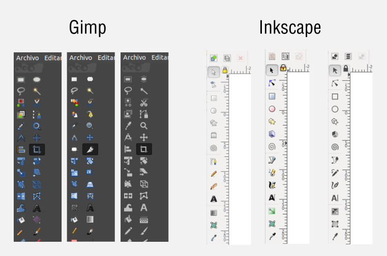
Icons color.
I use Blender since version 2.34, the program is great and I keep recommending it to everyone I know. The decisions that have been made in these years in terms of design and usability have always seemed correct thanks to the fact that they have been agreed with the community, both users and programmers. It is its great strength over other programs. The other time I did the exercise of thinking that I did not like the decision and I still do not like it and they are the icons in one color. Today I use blender and I don't think about it much, but the reality is that it has affected the speed in which I find the tools and modifiers. The same I have observed in other users more advanced than me, it is seen in their videos that when they need to add a modifier they lose a second or more in finding it. The reason for using single color icons has great rationale, gives consistency and makes the app design much more enjoyable. The previous icons were chaotic in their shapes and colors. This same process is being suffered by several free applications that I use every day, for example Gimp and Inkscape. They opted for a very good idea: give the user the option of what type of icons to use. We can have the interface with icons in a single color obtaining a coherent and attractive aesthetic or choose the usual icons with volume and colors for which we prioritize productivity. I think this implementation would not be so complex to do in Blender and I am sure that many designers would be happy to make their contributions. What do you think? Would you like to have that option? To me yes, a lot. Regards.