
UI / UX - "Pivot Point" Menu Consistent Look
Just noticed this difference with the Pivot Point drop down menu.
It's different from the other 3, and for no discernable reason. Could easily look just like the others.
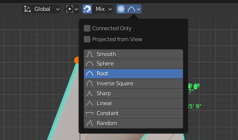
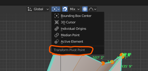
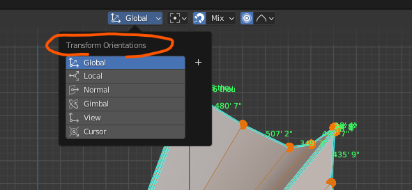
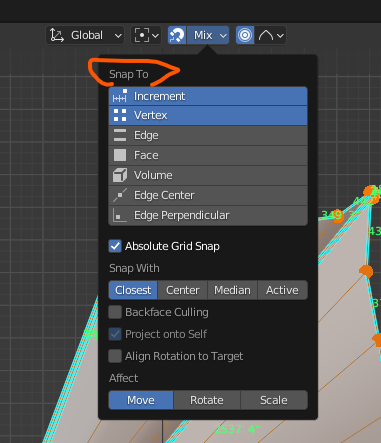
Notice the Menu Headers are on top, except for Pivot Point, as well as the formatting of the options/buttons.