
Better Active Area Highlighting
Edit #2 - interactive mockup! codepen.io/Aeraglyx/full/yLXLYjX
Blender is very context dependent, so it's important to know which area is active . E.g. when you want to type in the Python Console or mute a node instead of moving to collection...
Currently we have a
hard-coded
header highlighting (
more like darkening of inactive, it seems
Already fixed, thanks Pablo
), which makes it difficult to theme (and in some editors, header and "footer" are linked, but one is darkened) and often isn't that visible.
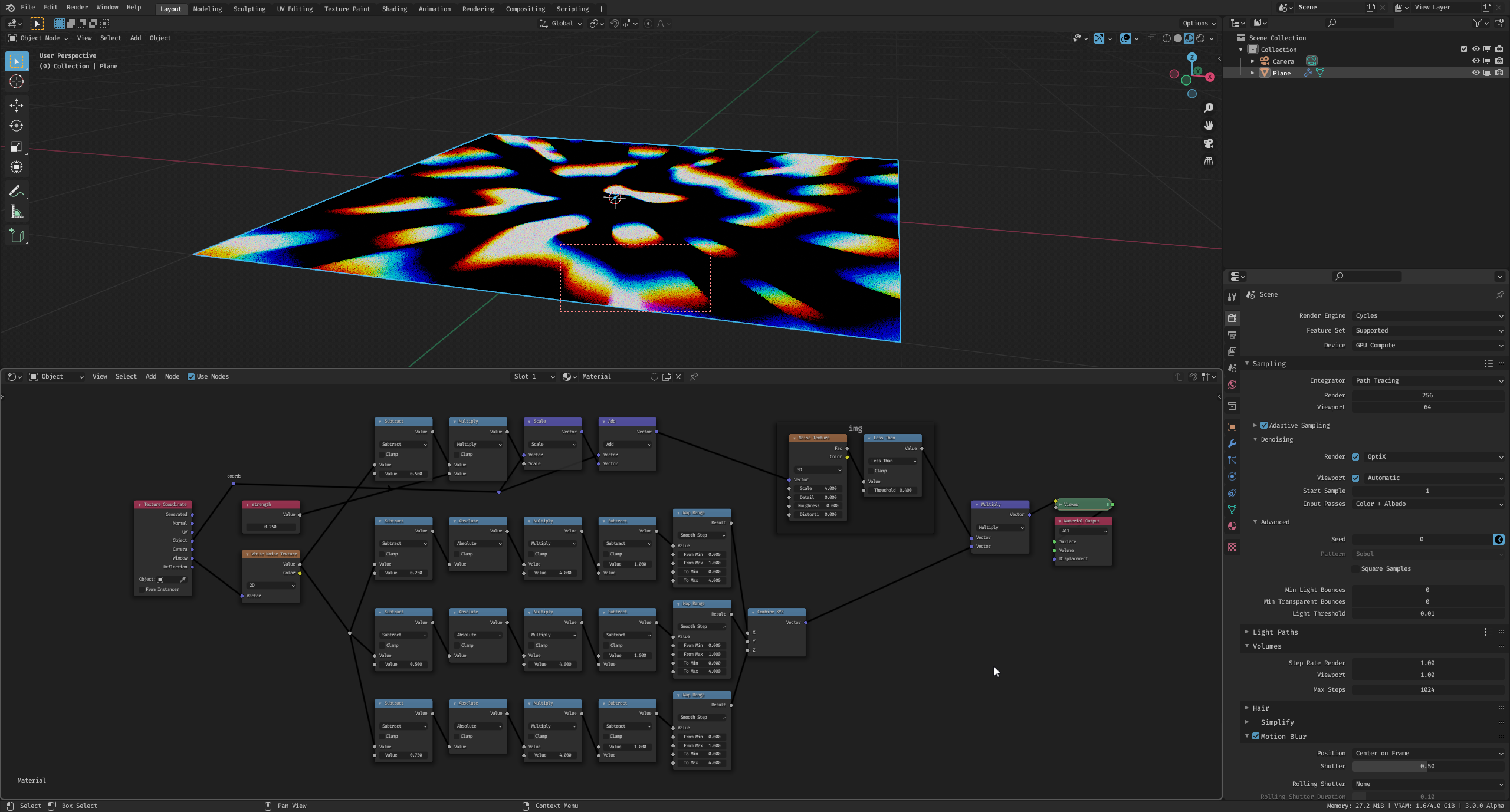
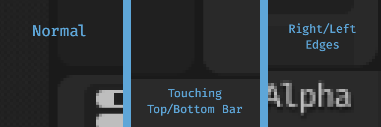
I think it could be beneficial to have an outline around the whole active area and get rid of the header "highlighting" (exaggerated for visibility here).
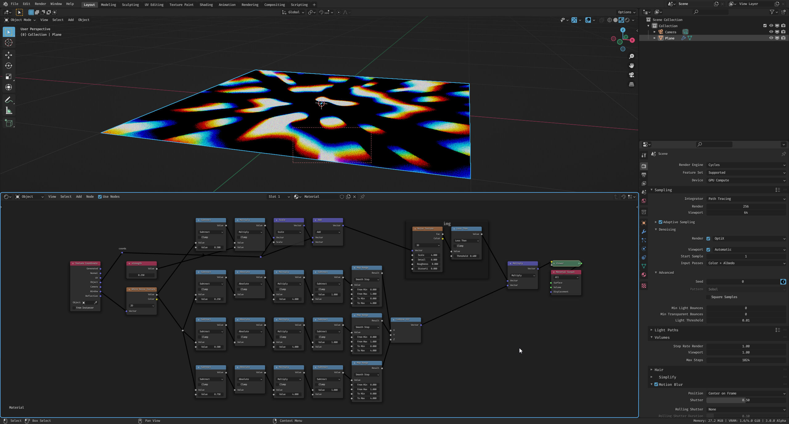
It could be more subtle (
go fullscreen
), the colour needs to be customizable.
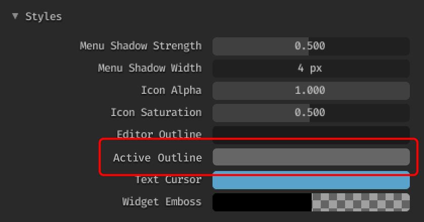
The setting would be located in
Themes > User Interface > Styles
, just below
Editor Outline
.
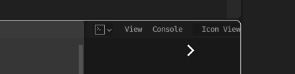
Edit #1 - I was trying to figure out whether the border should take the full outline width or be thinner, but as noted by -L0Lock- , a lot can be borrowed from 3.0's area-joining functionality.
I also found a design task that acknowledges the issue - developer.blender.org/T68830 , maybe 3.0 would be a good time to tackle this since there are more UI changes planned?
And lastly, there are some inconsistencies regarding the editor outline width, it would be nice if the gaps were the same everywhere.
Thanks!
4 Comments
I think the idea is nice, and I guess it can be done by taking inspiration from what was made for Blender 3.0's area-joining outlining :

Though aesthetic-wise I think the wide pastel-light-blue is a tad too much, I'd go for a less in-your-face default setup. More in the line of the new area-joining outlining, why not actually the same, which would of course be turned off when joining areas and making it easier to understand we are joining into a new active area.
Agreed, some grey-ish color as default would probably make the most sense, I was just afraid people wouldn't notice anything in the mockup that way.
It could be nice to have it somewhat coupled with the area-joining, the shape of the outline is indeed perfect for this.
Actually we have this for a while now, so marking this as: Done!
In Preferences, Style, "Active Editor Outline" will do the trick.
I like this version. blender.community/c/rightclickselect/VvQ1/ Visual (color) indicator on UI, which edit mode is active