
Suggestion for improved dopesheet UI e UX
Hello. Blender has become a much more mature software and easier to dive into. I thank you all, developers!
However, the UI and UX of the dopesheet can be improved with some basic adjustments in order to create cohesion between all Blender editor's.
1 - Moving keyframes using only mouse. Right now, one does need to press G in order to move multiple keyframes. As far as I know, this is the only part of the Blender where this workflow is needed*, which causes confusion. For instance, to move multiple nodes you don't need G.
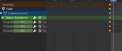
2 - Dopesheet can be really populated with lots of keyframes. There are some hierarchies while animating, but once you open them all, there is a lot of keyframes vertically. It shows:
- Summary
- Cube
- CubeAction
- Object Transforms
- Object Transforms Channels
So there are 4 levels of hiearchy, which causes the dopesheet to appear really populated and confusing. My suggestion: maybe an option to disable all the hierarchy (something similar to Action Editor). Or maybe some sort of "ghost color" (for higher levels of the hierarchy) to make easier to understand what's going on.
Link for reference: gyazo.com/803ee512b57de1df625daab1ec31d1ce
Thanks!
- I've just noticed that UV Editor shares the same behavior, so it should be included here as well.
7 Comments
We need this so much, coloring the keyframes in rgb for xyz would also increase readability.
* @danielpaulus90 * that coloring idea for xyz is great. You should make a proposal. If not can I?
* @daniellapalme * You can, if you like :)
* @danielpaulus90 * blender.community/c/rightclickselect/cldbbc/
This is a good proposal. I think the DopeSheet could use the same filter UI as the Outliner (there's a funnel icon, and if you open it up you can toggle the visibility of various elements).
I think the keyframes could be shown just in the Summary and in the lowest hierarchy level where it's opened. Taking your example: if there's a keyframe at X location, but everything is collapsed, it would be shown at Summary and at CubeAction.005 only. But when expanded one level, it would be shown only at Summary and Object Transforms. And when fully expanded it would only be shown at Summary and at X Location level.
Not sure if I made it clear or just confusing.
* @Andy Cuccaro * That's a nice idea, I was going to propose these features myself just right now. I think we can still have some indication about keyframes when we expand the hierarchy, but just a little tiny semi-transparent dots instead of the same big yellow circles. Only the last level of expanded hierarchy and the collapsed one should have these.