
[Update 1] 2.8 Proposal - Less Girth, More Colour (Dope Sheet)
Image Source
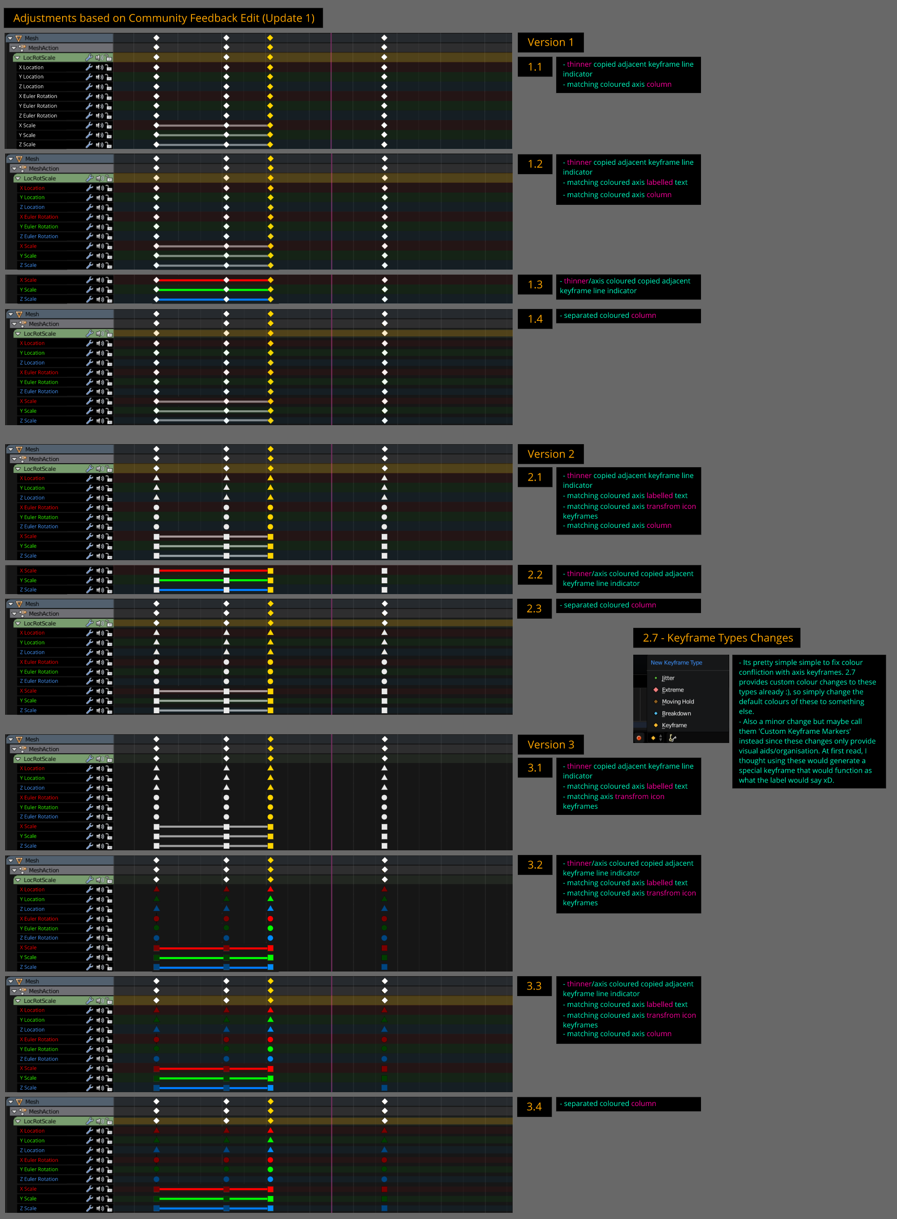
This is an updated draft implementing some feedback from my initial proposal .
My choice:
- I personally prefer 3.2, I feel like specified keyframe icons and allocating
them a colour is faster to read then having the background row tinted with the local axis. I feel its more easier to scan and memorize axis/transform via colour and shape. Plus the tinted backgrounds are starting to look like fruit roll ups, yummy.
- Also see diagram below for information retaining to 'Keyframe Types' and a solution with conflicting proposed custom axis icons under '2.7 - Keyframe Types Changes'.
Additional notes:
- If 2.8 theming allows axis colour changes, let custom colour adjustment be added to a reworked theme editor (we literally need to replace the current theme options, its frustrating to play with).
- In 2.7 bone groups colours do affect the colour of the dope sheet rows so this would have to be removed in 2.8.
If you have anything to add, comment or critique please do so. I'll try to add it to an 'Update 2' if I have time.
1 Comment
The more I look at the one with colous with white overviews.. the more I can see myself LOVE this. Having all keys the same colour with no background or colour coding makes the overview hard to use and also quick to make big messes.
Though, using the Keyframe type system may be conflicting ith this system, so having only background track colours seems to be the only option, and having the constant axis colour lines also. Meaning, version 2 would make more sense and be compatible with the Keyframe types.