
Proposal for gizmo
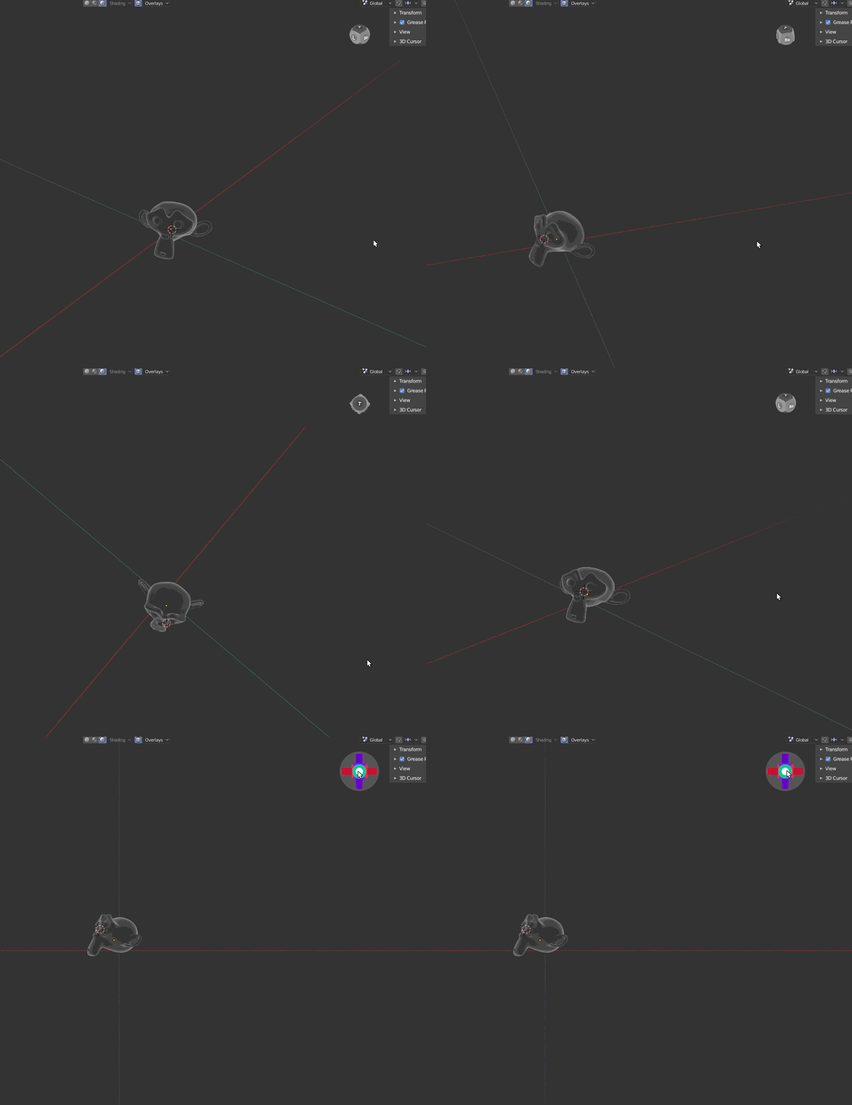
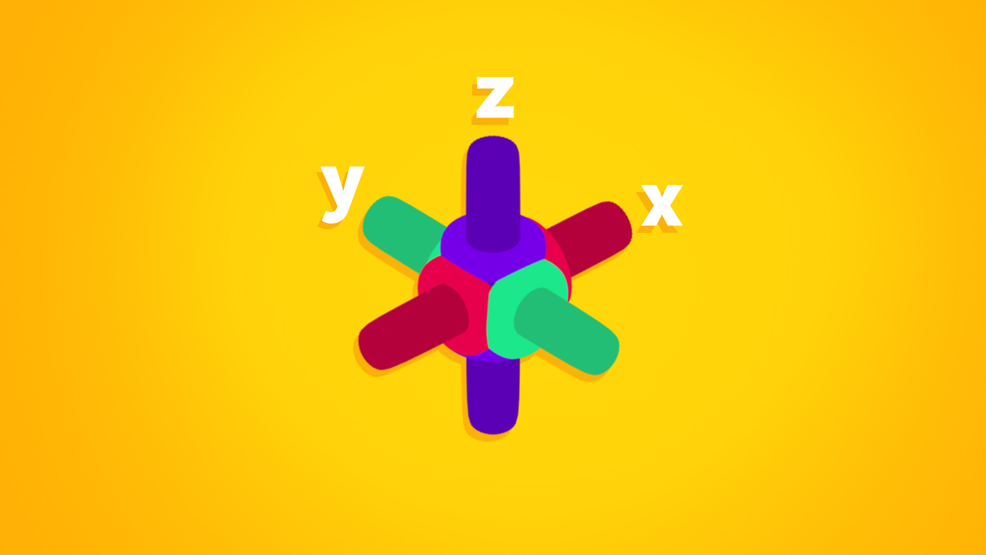
Dynamic and compact, this design offers a non-invasive user experience in a "passive" mode, and a dynamic and colorful mode in its active state. I invite you to see more about other blender projects at behance.net/GaboSalcedo
//Dinámico y compacto, este diseño propone una experiencia no invasiva para el usuario en un modo "pasivo", y un modo dinamico y colorido en su estado activo. Los invito a ver mas sobre otros proyectos de blender en behance.net/GaboSalcedo

Alternative


Los invito a ver mas sobre otros proyectos de blender en behance.net/GaboSalcedo
23 Comments
it looks cute, but having to hover on the main one to get to the other ones is actually too slow, i actually liked it the way it was before with the four buttons spread around the main circle
Very good idea, so clear and cool! Iwould say faster animations could be better.
i like the desing a lot but please keep the original axis colors.
and the Hover action i'm not sure about it, maybe it can slow the production speed when working with blender. try moving the other icons in a corner around the "cube" ( like a mini pie menu ) and keep the X Y Z labels always displaying (or print them on that "cube" ).
amazing work btw. :)
I really like the dynamic gizmo a lot. The hover action of making the other navigation buttons appear, my be too slow for me. I'd rather not have to wait for it to pop up.
it's not only the other buttons, it's also the gizmo's colors and orientations. In the current mockup, this does not even indicate the axis orientations and directions, which is supposed to be its primal use.
I think it's a fantastic design. I think the animation is a bit slow, like previous posters have mentioned before. How do you tell which direction is positive/negative?
@Armando Tello: I am sure that the developers are working this out, along with the other tweaks needed to make this work well. In fact, Pablo mentioned this proposal on his live stream: youtu.be/BBuD64KhxeY
@msheaver: wow! no estaba enterado :D
It's really good clean and small enough that if you don't use it it's not an issue. I still think that the "idle" animation should display the XYZ coordinates like in the first animation. Really good job
Currently they are testing, ctrl + MMB to change view. The box apparently is registered by Autodesk. I made a flexible proposal in which each user can put their own low poly model. I invite you to look at it. blender.community/c/rightclickselect/nBbbbc/ . But yours could be the one that comes by default, it looks good.
Fantastic and innovative idea! I saw some people making a fuss that they won't see their axis orientation. I must admit that I use that far often than looking at the cube for figuring out which side is which. Maybe when in idle(grey) you will have the axis(XYZ) instead of the (front, back, left, right). Or maybe give the user the ability to decide which he prefers, seeing the XYZ in idle or FBLR.
@okuma_10: Gracias, agradezco mucho el feedback de todos y sus criticas constructivas. hay muchas ideas geniales y poco tiempo para implementarlas, pero las tengo muy encuentra. Gracias
@gabo.salcedo.z: Yes of course, but just to note that I personally like the "alternative" version you gave.That way all the clutter with the view controls is hidden and is visible only when you really need it.
It looks really nice and easy to understand
So it basically gives no information until you mouse-hover it?
@loic.dautry: No, you get the rotation of the viewport. This is perfect so it doesnt distract you while fex. modeling but when you want the information it gives it to you
There are no colors and no directions, so you only know the orientation of unknown axes but no clue which one is which one, which make this almost useless.
Disagree, it's far from being perfect nor "not distracting".
And if the goal is to not be distracted, then maybe the simplest way is to disable it and use the shortcuts instead, which anyone hating UI distraction will probably do anyway. Plus all the advanced user because they use the shortcuts anyway.
Yes, but these things are needed all the time when modeling, so it means that you have to hover back and forth all the time. And this can get even more horrible with multiple windows/screens.
The very "raison d'être" of such UI gizmo manipulator thing is not to be discrete and not distracting. It's the exact opposite :
Con esa animación tan lenta se hace difícil, Seria mejor y mas rápido seleccionar con el mouse las vistas en áreas mas grandes del gizmo, como en un cubo o una esfera sin menús desplegables cuando asentas el mouse.
Dynamic and compact, this design offers a non-invasive user experience in a "passive" mode, and a dynamic and colorful mode in its active state.
I invite you to see more about my work at behance.net/GaboSalcedo
@Artturi Mäntysaari: Gracias Artturi mi ingles no es muy bueno.
@gabo.salcedo.z: Recomendaría el uso de este sitio web. Esto creará un inglés de muy buena calidad. deepl.com/
Yo mismo no puedo hablar español en absoluto, pero lo uso siempre que necesito traducir algo.
For me this was the best design. The current one is so standard and uncool.
Great idea. Please keep original colors of axis! Additionaly think how user could rotate view by 90deg after picking top/left/fron/... view - this is a thing missing from current one.