
Optimize the display of the modifier menu panel
Currently, as the property panel is often located on the right side, the expansion of the three-level menu is restricted. The final presentation is that the three-level menu is superimposed on the first-level menu, making it visually difficult to distinguish. Automatic color layering similar to Node Label or other means are needed for distinction
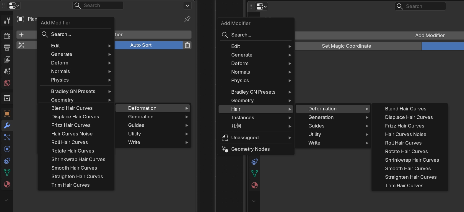
For example, make a distinction like this projects.blender.org/blender/blender/pulls/138649
1 Comment
This is not limited to the modifier menu, the issue you mention could be solved with this proposal: blender.community/c/rightclickselect/L5rv/