
proportional editing, viewport visualisation
I think the following additions to proportional editing would be useful:
- visualisation of the fall-off on the mesh/objects
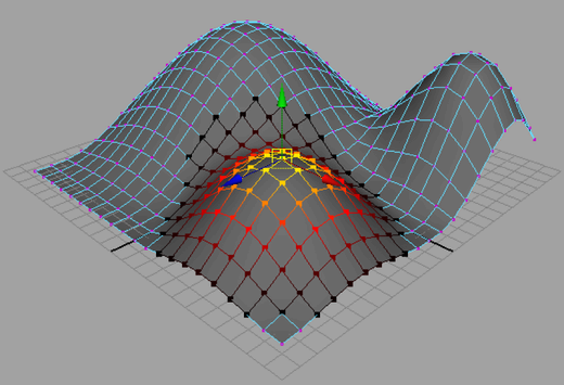
e.g. Maya soft-selection (
image source
)
- toggle topological influence
base the influence of the fall-off on the contiguousness of the mesh (edit mode only, I suppose)
edit: topological editing in the way I described already exists, thanks @Jason van Gumster
9 Comments
We don't have the color influence and it's really useful!
@Cédric Lepiller: If this were to get implemented, I would suggest that we use the same gradient that's set for weight painting (for similar reasons... we can customize the weight paint gradient for users who are color blind. It'd make sense to leverage that adjustment here, too).
I don't really see a point to this... You can already see what you are influencing anyway...
@visprotis: With 2d brush you can only assume area of effect, often it results with unwanted changes on mesh that you may not notice right away. Also to adjust influence you need to start transform, but on heavy model you don't want to do that because blender can become incredibly laggy. In any other 3d app you just select vertex and see what soft selection going to affect, i think blender should utilize this approach.
@visprotis: Only if changes are clearly visible, if You only make subtle moves its harder.
base the influence of the fall-off on the contiguousness of the mesh (edit mode only, I suppose)
This already exists in Blender. It's right there where you choose the Proportional Edit feature... or try the <kbd>Alt</kbd>+<kbd>O</kbd> hotkey.
@Jason van Gumster: Ah, never knew. Thanks!
The only patch that was working on this feature died years ago. developer.blender.org/D4786
maybe better to change the title to be more specific like "Gradient Falloff color for Propotional editing". Uploading a thumbnail would also help
there is an ongoing thread at Blender dev talk about this devtalk.blender.org/t/gradient-vertex-color-for-proportional-editing/949/56
this and custom curves for the Falloff would make this feature instantly ten times more powerfull