
Multi column UI
I know this was discussed at some point during early 2.8 development, but it seems to have been put on hold. Comparing older versions of blender to the most current version of blender, the UI is taking significantly more real estate, meaning that one needs to scroll more to find what's needed. This is especially an issue when working with many modifiers.
It would be great to either do two column UI automatically if the width of the properties is made large enough, or even better - add an option in preferences to have a multi column UI, where the user can toggle on/off and set the max width of a single column , similar to css in html.
Having more visible in less space make working with complex files much easier, as otherwise fatigue forms to finding what's where.
For reference, here are two UI elements showing how much more vertical space they are taking in the latest version of Blender.
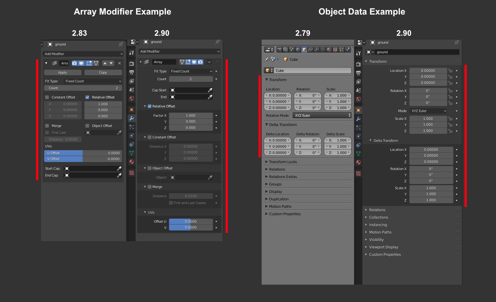
13 Comments
As a UX designer and not daily Blender user find the vertical layout more clear in terms of locking, keyframing.
! Bias, i have a 27 inch display.
I find it strange to have elements with only one option collapsable. Like Viewport display -> color setting, Rather than just Viewport color.
* @hemdrup * Yes. I feel strange why certain blender features have a separate panels at all. Like the Autosmooth feature inside the Normals panels -- it is the only option inside yet collapsible.
But, I think this is being addressed currently for upcoming releases.
* @Salai Vedha Viradhan * I have three 38" 4k display, nontheless, i still find vertical scrolling (not real scroll but with my eyes beceause my screens are bigs) verry inconvenient.
Tested latest 2.90.0 and find that in some cases its good, and in some like Modifiers it's horrible designs. I need to click on each column to find stuff. And imagine that you have 10+ modifiers how long you will be scrolling? Maybe if this was implemented also, it would help a lot for consistency twitter.com/FinEskimo/status/1106948247489257475 some similar blender.community/c/rightclickselect/ksdbbc/
* @Eugene D * Exactly! To adjust an array modifier, it takes a lot longer now with all the different sub-tabs that need to be expanded. Before, I could just click add add and adjust all the settings. Now, we click add, then click again to expand one tab, scroll down, click to expand another tab, scroll down to change a setting,
* @Dimitar * I agree on this. Modifiers have become a little too fiddly after the new design. I think modifiers are accessed more frequently compared to other tabs in the properties windows or other parts of the UI. And this becomes a problem with huge stacks.
Maybe if the panel shows only the selected modifier, similar to the material editor see only the selected material, we could reduce unnecessary scrolling. People have been suggesting this for a long time.
devtalk.blender.org/t/new-modifier-panel-and-list/12601
hey hey hey, if you want that multi column UI, then you first need to change it in modo/maya and photoshop. Those are the apps that 2.8+ is copying stuff.
Blender 2.90 bevel modifier is now slightly tedious when it cpmes to accessing functions.
* @johnpdelacruz28 * I'll just quickly develop all submenues to found the right checkbox beceause i don't remember in what subcategory it is sorted.
Blender has dynamic layouts in a few areas. One such example is the Physics panel where the buttons automatically switch between single and two column depending on the panel width.
I feel the single column layout to be more clear by design. The older design that you are pointing out definitely reduces scrolling but also removes consistency across the UI.
I don't think scrolling is necessarily a problem as long as the interface feels predictable. Current layout does that really well whereas with the older layout, every panel is different. This becomes a struggle especially in the particle properties where you had a lot of misaligned sliders and values.
I generally work on a 24" inch full HD monitor and I usually don't feel like I am scrolling a lot.
* @Salai Vedha Viradhan * I find myself much less productive with later versions of blender and I work with them all the time, as I constantly have to scroll and expand sub-tabs to find what I need. I am sure there are people that prefer single column layout hence the suggestion for an option to toggle on/off and adjust width of a column
On Sass projects, I love having collapsable menus like this, as it allows us to add more features and settings options very very fast. Without big UI implications. Even if it might hurt UX a bit.