
Reorganization of the tab icons
Strictly forward. Reorganization of the tab icons. Rendering at last... At the moment is it very confusing. Rendering settings at first? Hmm, i don't want first render the cube ;)
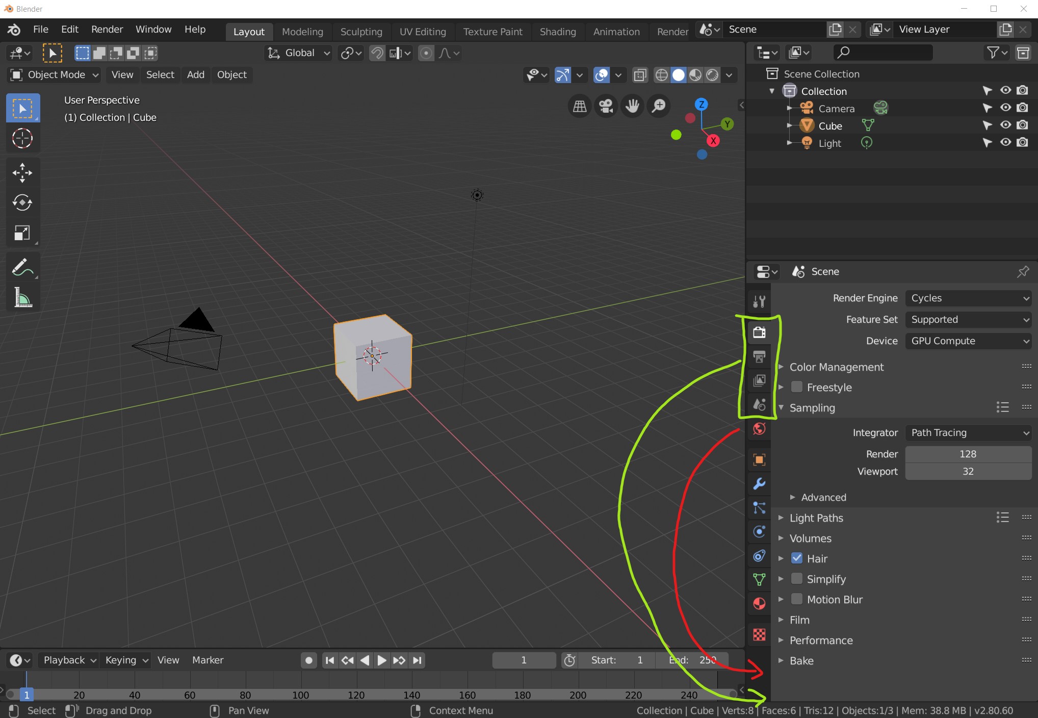
Strictly forward. Reorganization of the tab icons. Rendering at last... At the moment is it very confusing. Rendering settings at first? Hmm, i don't want first render the cube ;)
6 Comments
This image gives a good explanation of the rationale for the current ordering: dev-files.blender.org/file/data/tv5iqwelnqefnezixn33/PHID-FILE-yxlmeo2r4gnxozqfrrv7/Screenshot_2019-03-29_at_09.24.01.png
The order is derived from the natural hierarchy, from high level to low level.
The design is intended to go from the largest scope down to the smallest scope... not by sequence (because not everyone opens Blender to work on the same things in the same order).
* @Jason van Gumster * But the red icons are closer and the rendering are the final step in the workflow. Without model, you don't see everything. And look at the tabs at the top of the screen: 1. Layout, 2. Modeling... not Rendersitze or others ;)
* @Jason van Gumster * I agree, in many cases, it's more about global setting, not the workflow.
* @Ein Kaiser * Rendering is not always the final step in everyone's workflow. The Properties Editor doesn't change based on screen layout for any particular workflow. This is a good thing.
* @Jason van Gumster * However, it is uncomfortable to have the frequently used icons at the bottom (of course, depending on the work you are doing). I don't vote in this suggested order, sorry. On the other hand I made a suggestion that could solve part of this problem. More configuration options for Properties Editor.