
Properties Editor. Suggestion to simplify it.
I edit the post . I opened a new simpler suggestion and I think more functional: More configuration options for Properties Editor.
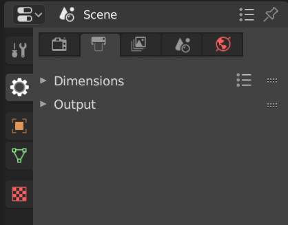
The "Properties" editor is confusing due to the amount of icons it displays.
Currently the side icons are divided into 4 groups: tools, scene options, active object and textures.
I suggest that these groups be more obvious and, at the same time, reduce the displayed options.
In this image I illustrate the suggestion:

The scene options are compact. Many of the options in the Render, Output, View Layer, Scene, and World sections are usually not used or are set infrequently.
Only the options for the objects we're using are displayed. Normally, not all objects have physics, particles, constraints, etc. However, these sections are always shown now.
In the same way, there are many options tabs that we don't generally use. For example Stereoscopy, Metadata, Freestyle, Hair, Custom Properties, Motion Paths, Texture Space, Geometry Data, etc.
Hiding some of these tabs would help you find the options you are using faster. It would also be very useful to work with someone unfamiliar with Blender, leaving visible only the options you are going to use.
For this I suggest this simple popup:

I also take this opportunity to give a strong greeting to all of you as I have just joined this community.
Greetings!
18 Comments
In photoshop you can activate/deactivate right side panels from the Window menu. A simple and elegant solution but since blender is more complex the menu list can have categories/subcategories.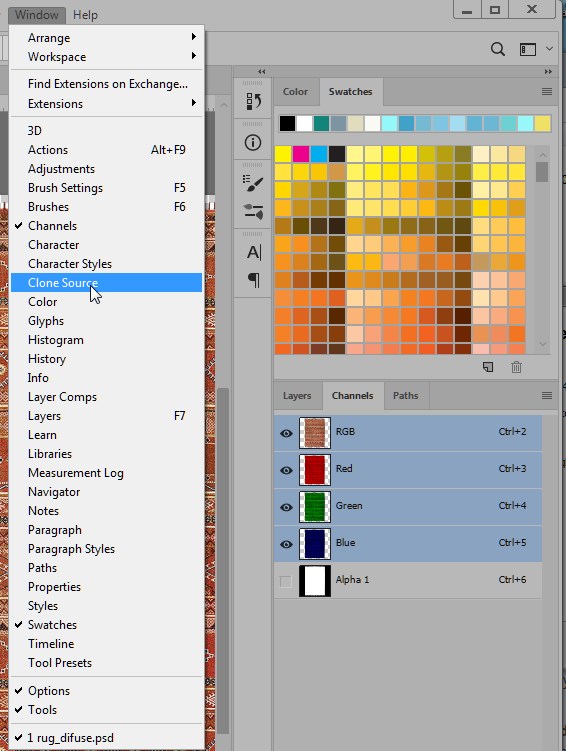
* @Ge Ro * I was about to make the same suggestions. This is the best solution for my tastes.
* @Ge Ro * Exactly, something like that is being implemented in Godot Engine. It would be great to see something like that in Blender Godot Engine Disabling / enabling features.
I made some changes after your feedback.
I really think there is a problem here with a lot of information for new users. I totally agree with the comments so far, and I think that maturing this suggestion could make a new suggestion more solid. Hopefully we'll come up with it! :)
* @Luis Perez * I'm thinking of maturing this idea and making a new suggestion. It's simpler than the original and more configurable.
There is an error in the image, in the second column (option 2), the Object button should be off.
I would prefer not to go in this direction. We had something roughly similar in Blender 2.4. We discarded it because it made switching Properties too slow and cumbersome. It meant that you had to first click on the parent category, and then locate the sub-category, every time you switch section
A possible solution involving your mockup might be just: remove the cog and keep the current icons; just divide them into two categories (scene / object) and display them as you did, horizontally and vertically.

I like the idea of hiding some panels but it must be somehow clear when panels are not fully shown (i tried coloring that icon)
* @ Lsscpp * Exactly, the idea would be to collapse the scene and object categories in some way.
But what icon do we keep for the scene? I think they should be a little different to indicate that they are collapsed.
In the image that you put, I find it confusing to have the buttons up and on the side. Right after you I commented with a similar idea, but the horizontal icons are within the selected category (I think it is better understood in the comment image)
* @ Lsscpp * I'd like to go one step further and have those 2 groups as entirely separate panels: Scene Properties and Object Properties.
* @thinsoldier * Perhaps there would be many separate panels, Scene Properties, Object Properties, Tools and Texture. But! ... ... With the collapse option it would be easily configurable what you say:
* @Luis Perez * I edit the scene properties very seldomly (except for the world lighting) so I'd probably close it, but yeah your screenshot is sort of what I'd prefer but I prefer the vertical tabs the UI has currently:
* @thinsoldier * I published a new suggestion with this idea after feedback. Maybe it's just that, to have some configuration options for this very complex Editor. More configuration options for Properties Editor.
I support this for render, output, view layer, and scene. I touch world a lot. I am undecided on the other because I've barely used them yet. I don't think the menu for hiding options is necessary. I just rearrange them in the order I use them most an save my startup file.
Are all the icons a different color? I'm partially colorblind so I think I only see 3 colors in the 'current' screenshot.
* @thinsoldier * For the scene options part, maybe one has the option to have the icons on the side or collapsed? For example as with window menus:
Currently if we select an object we have 14 icons displayed. This doesn't help to make the interface more user-friendly (at least from my point of view). If you are modeling or sculpting, for example, there is too much information there.
As for the color, there is more or less half white and the rest with color. But that is not part of my suggestion. They are currently working on the color of the icons so I guess there will be changes these days.
I was actually considering proposing something along those lines a few weeks ago, but as I was doing the mockups I realised its more confusing than the original design, so I didn’t publish it.
The main problem is the hiding of tabs. What took one click now takes 2 , also if you don’t know a option is there it’s difficult to locate it within a subgroup.
The mix of horizontal and vertical navigation is confusing.
You cannot easily tell the main navigation from the secondary navigation.
I don’t know it’s just the designer in me that don’t like the concept.
In my opinion the current state is fine, they could just emphasise the grouping a bit more using some white space
* @george.mitev * I also raised the points you make, and I share them!
That's why the idea is that when you activate the modifiers, for example, the icon will appear on the side. This way we avoid the double click. But I'm not seeing the physics icon if I'm not using them, for example.
As for compacting the scene options, at least in my case, the Render section is the one that I am changing frequently. The rest I configure when the time comes, but it is not something that uses most of the time. But there are always those icons there to confuse! :)
I think this would also help people who are new to Blender. Now it's very confusing to try to tell someone to click on a specific section.
Your icons are color coded. Is that your suggestion as well or are they just missing from my version?
* @NKO * They're in the official version. Possibly they added the color yesterday. If you have today's version of Blender try "File/Load Factory Settings". I hope it helps.