← All ideas
17 May 2019
salvador
Open
User Interface
salvador
Korax
Orphydian
Roadkill
SPYReox
Shimoon
bestelix
bnzs
conrad.dueck
eni.valentin
giuseppe.bufalo
jon
matan.golomb
michaelknubben
mortas_may
nanomanpro
orpot
romanvolgushev4565
srikanth0126
testure
zuorion


4 Comments
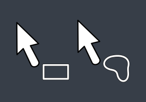
One symbol is more readable than two, that have big similar parts. So disagree with your examples. But there may be another cursors.
hmmm a simple arrow for the box selection cursor in both object mode and edit mode would suffice for me. That cross in edit mode always bothers me. Its bassically, mainly a direct selection tool with an additional box selection function. Nothing special to require a different icon or a different cursor.
Related to this proposal and this proposal .
box select is the default tool and i wouldn't like it to have a complex cursor like that all the time