
Blender 2.9 Column Headings result in 71.3% INCREASE in wasted Screen Space
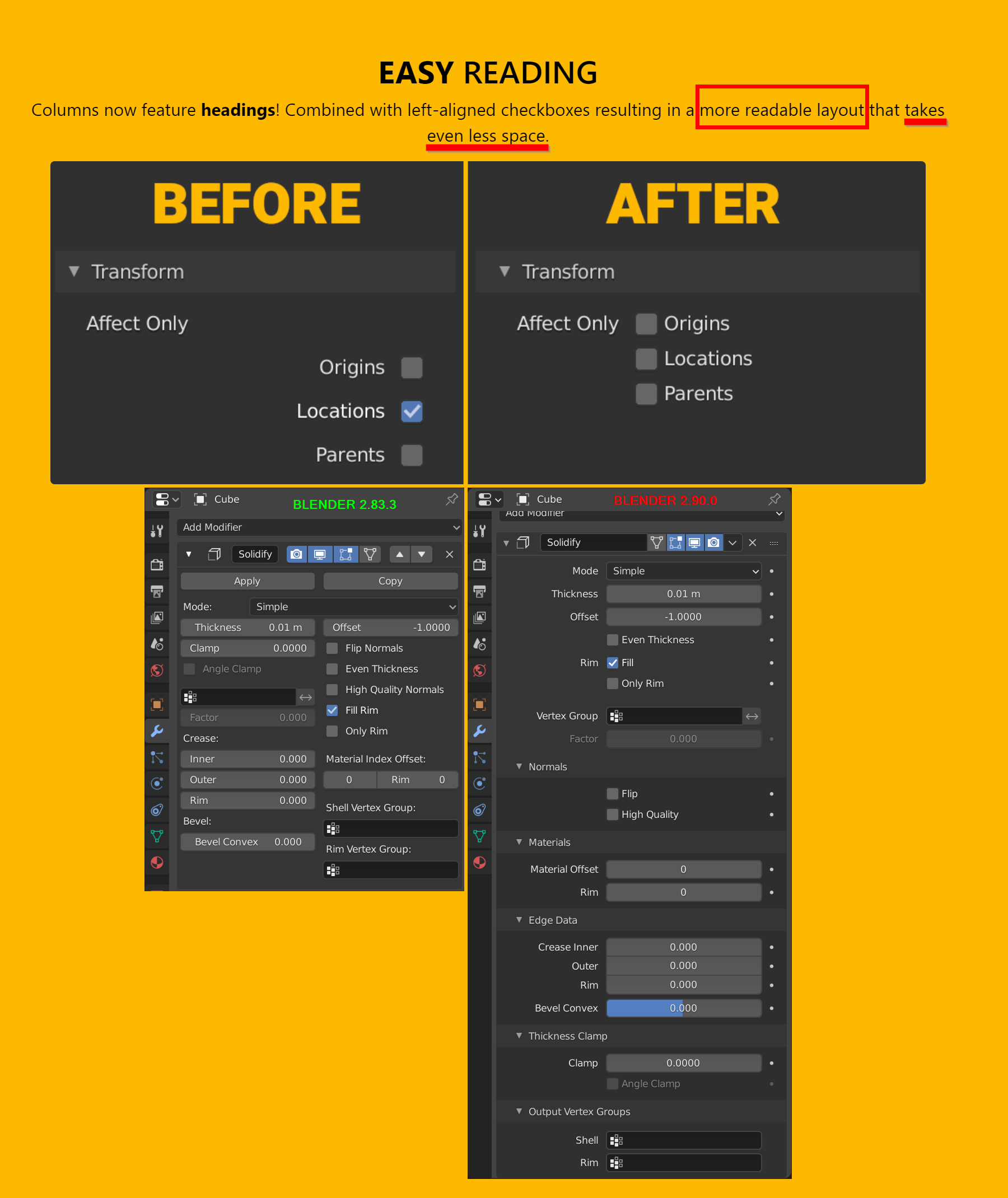
Blender 2.9 features a fantastic new feature that lets you re-order modifiers by dragging them, and I am extremely thankful for this change. Unfortunately, not all changes to the UI have been beneficial to the user. The new column headings change results in a huge amount of wasted screen space: using 71.3% more vertical height than Blender 2.83.3. Now you will find yourself scrolling twice as much as before.
The original modifier layout in Blender 2.83.3 was far more efficient. Everything fit within 721 pixels of vertical screen space on my 2560 x 1440p monitor.
The new Blender 2.90.0 modifier layout with column headings (shown below) results in a MASSIVE amount of wasted screen space, requiring 1235 pixels of vertical height to display the same info. This means the outliner has to be fully minimized just to see anything in the modifiers panel (as fully expanding a modifier uses nearly the full screen height). While 2.9 can "technically" use "less space" than 2.83.3 when all headings are minimized, this defeats the purpose of productivity, requiring the user to constantly expand/hide headings to see what is going on, rather than seeing everything at a glance as in 2.83.3. I hope the talented Blender devs will be able to return to the previous UI look for modifiers, while keeping the excellent new drag & drop feature they created.
Thank you so much to the devs for considering this important UI fix.
Best regards, Adam Janz
9 Comments
Speaking of readable - black text on such aggressive background is almost not readable :)
As I guess they made such layout for more consistency in alignment + for such " sliding " things & keyframing + maybe it more readable in small size. But yah, since I don't care about keyframing and I can keep it wide on 27" 4k - 2.83 is kinda compact & comfort.

* @IIIFGIII * Based on my resolution scale (1.6) in Blender's preferences, fully expanding the modifier almost takes the entire screen which is not very efficient. I think this also may have been a side-effect of adding keyframe dots to the right of every property. Previously, you would just hover over a property and press "I".
* @Adam Janz * But without the keyframe dots I'd have to rely on knowing what colors mean in the keyframed fields. I'm colorblind.
* @thinsoldier * Everyone has different UI preferences. Some people:
I think a customizable UI would be a good solution because it's very hard, actually nearly impossible, to satisfy everyone's various needs with one perfect UI. Here's a link to my feature request: blender.community/c/rightclickselect/rzgbbc/
* @thinsoldier * I think they could still use the keyframe dots. But there's no need to have everything in a single column, as that is not an efficient use of space.
Honestly, I really liked the stacked view and enjoy using it, it feels less like total chaos and visually scary.
I also, think it will make maintenance, future updates, and plug-ins UI easier.
* @hemdrup * Well I suppose one does get used to it after awhile. However, being able to <b>lock the scale of the brush in Texture Paint mode</b> is a FAR more needed feature that everyone should up vote, as it affects basic functionality and already exists in Sculpt mode. :-)
i believe there is a forthcoming search feature that will allow you to quickly locate properties as you need them, even if they're buried in submenus.
personally, i prefer this approach of making properties on demand, as there's always going to be a practical limit to "showing everything at a glance" anyway.
that said, when making python UIs, there's an option for "column flow" which splits properties into columns dynamically as horizontal space allows. perhaps giving a UI preference for this might be a helpful option for those who prefer compact.
This join my other proposal (not really a proposal, more a troll post to claim that something need to be done about this) blender.community/c/rightclickselect/Lxgbbc/