
Interface redesign. Removing Windows title bar.
The title bar in Windows is very different from the blender interface and has little functionality and needs to be replaced by something else.
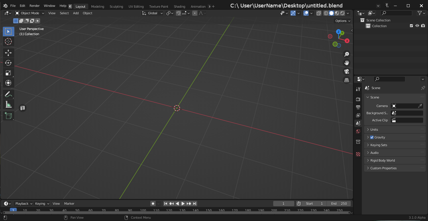 I hope you enjoy my subsequent ideas.
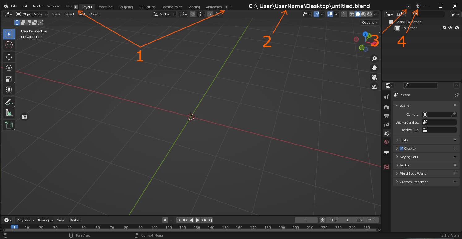
-
Workspaces take up too much space, I would remove some of them, but it is better to add a limit in the length of the list, the number of workspaces can exceed the length of the list, but to have them scroll through the arrows (and the mouse wheel when hovering over them).
-
Now we have a space for the path and the file name
-
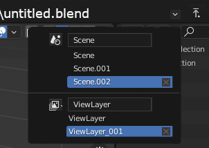
The tabs Scene and View Layer - also take up a lot of space, and they are not aesthetically pleasing, you can make a special drop-down menu for them, where you can do anything with them (I personally do not use this feature, and even if not to remove the Windows title bar, the tabs I would hide in a smaller)
 4) Quite often I want that the blender window would not overlap when other windows (other programs or folders) are activated, it would be good to add the Stay on Top button (in QuickLook it is implemented very well).
A question arises, but how to move the window itself, for this red marked areas where you can click and move the blender window. In order not to miss, it is necessary to make the title bar wider.
PS. It is probably best that the vertical width is larger at "Restore", and when it takes up the entire area of the screen - it should be narrow and not too conspicuous
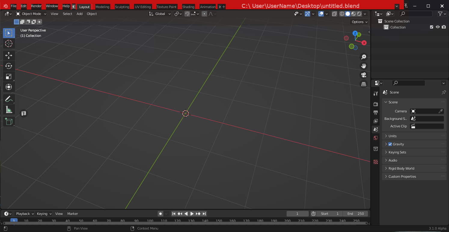
I would move functionality from TOPBAR_MT_blender to right mouse button and mix it with regular windows menu (useless for me). TOPBAR_MT_blender - remove the button from the icon, so you can move the window at this place too.
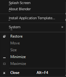 The "Stay on Top" button can be hidden in the right click menu, and when it is activated, it should appear next to the "Minimize" button
You could say this is a more amended version of this proposal, which takes into account the opinions of users who did not like such a radical proposal, as it was not proposed anything other than the removal of the title bar. blender.community/c/rightclickselect/Rjhbbc/
16 Comments
Anyway, showing the whole file path is very very unnecessary... The file name is enough. Hover over to see the full path as a "tooltip"...
Also, the Scene and the view layer could probably be in the outliner and/or in the properties editor, if there's no space for them... They should not be hidden in a tiny arrow button.
Completely agree with you, displaying the path to the file on the hover is a very good idea) I myself initially wanted to offer something about this, but decided not to heavily load the text.But at the expense of the Scene and View layers - there is a need to get an opinion of those who often use this toolkit, personally I rarely use it and here I can not be objective.
Completely disagree with you.
Why?
Lets say I have 3 blender windows open and all contain a file named "step 11 - retopo.blend" from 3 different projects. I'm zoomed in on some complex topology in each trying to decide how I can approach getting all quads in the newest project by reviewing how I did similar things in 2 older projects. The quickest way to check which file is which is to see the project folder name in the path.
The quicker way to see which file is which is by the file name, not the file path. Seeing the whole path will only slow you down. Unless you are weird enough to name all your files the exact same... If so, When hovering over the Blender icon in the taskbar, it will show previews of the three windows, and you will see the paths there (it works so now).
If this is even possible, then absolutely yes.
That's the concerning part I'm afraid.
Plus not everyone agrees to permanently get rid of Windows title bar for varied valid reasons. Most times this discussion happened it ended up with someone proposing it like a display option like photoshop (i think Krita does that too? 🤔)
devtalk.blender.org/t/merging-window-title-bar-with-top-bar/7162
blender.community/c/rightclickselect/Rjhbbc/
blender.community/c/rightclickselect/7dhbbc/
blender.community/c/rightclickselect/pddbbc/
While I think these options are welcome because they don't really change anything fundamental, why not just toggle fullscreen?
Because it works without toggling fullscreen.
If you're already short on space you're likely to maximize the window anyway. So I'm not sure if it's useful in any other case.
I'd rather the default title bar be completely replaced and the window controls fall down on to the same row as the main menu bar. The Steam app does it, why not Blender?
imgur.com/a/rccRpPP
Your proposal is around unsupported resolution (below FHD).
In normal resolution there is plenty space:
Blender's minimum resolution is FHD. It should work as expected at that resolution.
This is about modernizing Blender's UI. Windows is not the only OS Blender is running on. On Ubuntu Gnome it is even worse (even on macOS).
bruh