
Once again; sidebar sorting
reopening this post from 2016, since it was about 2.7x
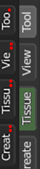
I think context menu sidebar/toolbar (or whatever its called), should add another label bar whenever it runs out of space (as you can see on the left - as it behaves now)...shortening the labels does not make sense. Also it would be very nice to have possibility to customize colors on most used ones and change order/position (rigt). In the original post there are more suggestions like scrolling, pinning etc.
If there's already some addon or other workaround, I'd be greatful for links, however this should be definitely solved by default somehow.

4 Comments
That said, add-on developers should probably do a better job of integrating their tools with Blender rather than burying it all into their own special tab.
* @Jason van Gumster * Some addons let the user choose in wich tab it will be. IMHO this should be done in every addon willing to be in the sidebar.
Yes,this is the part of the UI which is completely neglected for some reason. It'd also be great to be able to store presets for addon groups, for a quick transition from modeling to rigging to animation to shading, since a different set of addons would be used for every workflow/department.
I think this is a good first aid solution to this, some colour, multi column - atleast all the tabs will be readible. It shouldn't have to be a requirement to scroll sidebars when people use addond (you want a quick glance on all the system, not have to search for it within a tab) - and yes.. the UI should be more exposed to addons (like the post operator floating panel, toolshelf, header entries, a modifier, etc)... but sometimes it's not well documented or hard to implement a new system to what is there.