
Unify Sculpt Brush system and improve interface
blender 2.8 has improved the use of the sculpt thanks to the topbar, but I think that the way to work with the active tools has not been good for the sculpt system that has different needs than the rest of editing modes and areas.
My proposal is this
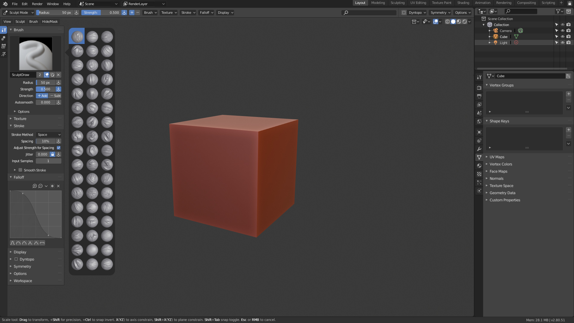 Main points
Unify Brush system
The main lack of the system is that in reality of all the brushes by default, at the moment of the truth, almost none of those presets of brush is used. For example in my case.
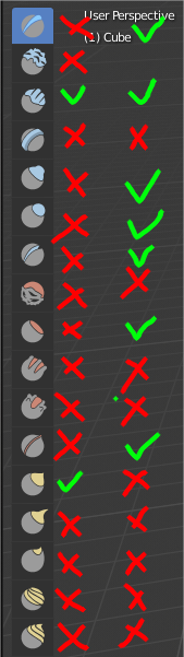 In the left bar are the brushes that I use by default, in the right bar the brushes that I use personalized.
Actually, when you work you only need a couple of base brushes and dozens and dozens of custom brushes. The current way of working of the brushes makes it very difficult to use custom brushes, because you have to select the type of brush and then go to a submenu to decide which brush you need. Doing necessary first to remember the type of brush that is, then go to the menu to change the brush you need. All this makes the task of changing the brush tedious.
I think that what the way to sculpt needs is to unify all the brushes, if brushes internally are different is something that should concern the developers, not the user who should be transparent the system. The user is only interested in having all the brushes at hand when he wants to change brushes.
Make a clear and simple icons for brushes
I think blender2.8 has made it very difficult to recognize brushes due to the use of flat icons, which are practically impossible to identify, even less for new users. For example, I needed to stop at enough icons to know what they meant because it was impossible to identify them by the icon.
Blender must use a thumbnail system like the rest of the programs because it allows to quickly identify any brush. And being complicated to create this type of icon nobody is going to use it in their custom icons, so you must use a simple sphere with a matcap to unify visually and aesthetically all the custom brushes of the users and the brushes by default of the program.
Replace the toolbar (spacebar) with a brushes selector menu
Since none of the spacebar functions make sense within the sculpting mode, you should implement a simple brushes selector menu that allows the user to select any brush they have. Without going into details of implementation on shorcuts, exact size of icons, aesthetics, if it should show the name of the selected brush, … it is very necessary a way to access quickly to the change of brush.
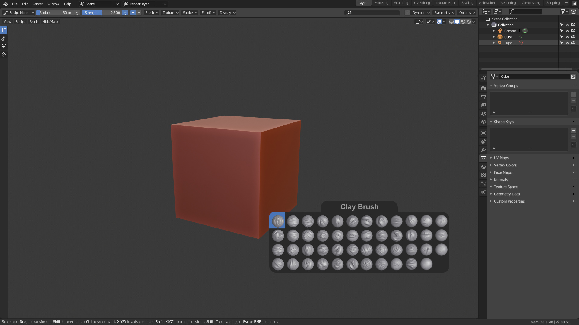
A menu that will automatically grow in size and will automatically arrange the brushes according to the user had loaded or not the number of brushes. Or if this were complicated in implementing that simply the menu would allow from the beginning a great quantity of brushes by default (70 at least). This is the biggest lack of blender at the moment at the time of sculpting and that makes its use very difficult.
Note: This proposal uses some ideas that I show in this other proposals
2 Comments
It's also strange to me that when I click on the brush popup selector (either in the topbar, or in the Properties->Active Tool area) it only shows the variants of that brush.... in a huge menu.... with a search box at the bottom.
Why would we need to text-search the variants of a single brush?
Why doesn't this menu include all brushes like it did in 2.79?
If it did, then users could choose to use new icons on left, or they could click on the brush pop-open on the topbar and pick a brush from the older-style big 3d example icons.
We need a system where you hit a button (to enter brush selection mode) then type in the first letters of the brush name and then boom you got that brush going.
For me that's one of the things that gives Zbrush it's flow. You hit B then (say you want "Clay Tubes" as an example) You'd hit "B" to go to brush selection then hit "C" then "T". Once you memorize the letter combos for the different brushes you're flying.
So we'd probably have to pick a different key than "B" cause we're using to for Box. Space bar is probably too deeply implemented in Blender the way it is now. We need more smart/secret keystroke stuff built in and way less gack on the screen IMO.